Sunday, June 30, 2013

Got the Blues


"White Wicker"
12 x 12
Lesley Powell

It's been a while since I wrote about a particular hue, but my post on REDS was very popular, so I've decided it's time to take a look at some blues. I typically use two blues on my palette, a light blue and a dark blue. 

For my light blue, I use Cerulean. Cerulean is a bright, vibrant color. I have learned that a little bit of this paint goes a long way! It was first developed in the 1860's, and it became an important part of the Impressionists' high key palette. This famous painting by Monet  features cerulean in the sky:


"Gare St. Lazare"
Claude Monet
The name "cerulean" is derived from the Latin word caeruleus, which in turn is derived from the diminuitive for heaven or sky.  So I guess it is not surprising to learn that the Impressionists often used cerulean for painting skies. Here's a plein air painting I did in the south of France that features a bright cerulean sky:


"Bonnieux Lane"
11 x 8

My dark blue of choice is Ultramarine. The shadows in the painting above are based on ultramarine, so the painting is a good example to show the difference in the two hues. 

Hardly a newcomer like cerulean, ultramarine has been used in paints for over 1500 years. It was used in the ancient world for cave paintings, and in the Renaissance by artists such as Leonardo da Vinci and Michaelangelo. Ultramarine is made from crushed lapis lazuli, which is a semi-precious stone. Lapis lazuli was, and I believe still is, mined exclusively in Afghanistan. But thankfully, the pigment has also been made artificially, and more inexpensively, since the 19th century.


Back in the mid-1600's, Johannes Vermeer used pure ultramarine made from lapis lazuli. Take a look at the wonderful blues in his work below. Imagine how vivid the blues were before time darkened them! Just as an exercise in high/low comparisons, I'm showing my own little denim jacket below, which is largely in ultramarine. Not that I would ever dream to compare myself to Vermeer--but it's fun to see old world and new world examples!


"Woman in Blue Reading a Letter"
Johannes Vermeer


"Denim Jacket"
12 x 10
Lesley Powell


Saturday, June 22, 2013

Plein Air "Paint Out"

"Above Mt. Pleasant"
8 x 16
SOLD

I have recently returned from a five day "Paint Out" in the mountains of North Carolina. The Paint Out was sponsored by The Crossnore Gallery, in celebration of the 100th anniversary of The Crossnore School. The week was capped off by a reception and live auction, where our paintings were sold to benefit the school's Stepping Stones Program.

Twelve artists were invited to participate, and we were directed to different parts of Avery County for each painting day. As a visitor who is not familiar with the area, it was a real challenge for me to find my "spots" for painting. First of all, I wanted to find a motif that would allow me to express the concept I was after. In painting landscapes, I was looking for "jumps in space"--a series of receding planes that would allow me to create a sense of spaciousness and depth in my painting. Here is my setup where I did the painting shown above:


I felt lucky to have scouted out the spot shown above. It is a tiny turnaround on the narrow mountain road. Beautiful scenes abound in the mountains, but it's not easy to find a place to stand so you can paint them--you need a place where you won't be run over by a car, or bitten by a dog, or arrested for trespass. I hear that they have shotguns in these parts!  (For a Wall Street Journal article on these and similar travails of outdoor painting, click here). Thankfully, each landowner I approached was kind enough to grant permission to go on his or her property to paint. Here's a scene just off Stamey Branch Road, which I painted from the driveway of a neighbor:


"Stamey Branch Road"
8 x 10
SOLD

One of my favorite paintings of the week depicts a white frame church (circa 1860) in a clearing above Valle Crucis. The churchyard is on a bluff overlooking distant ridges. All of the different green hues presented a real challenge in this painting, but I liked the way it came together.


"St. John's Church, Valle Crucis"
8 x 10
SOLD


For my last painting, I returned to my original concept--that the landscape is about SPACE and spaciousness. In this painting, my goal was to fine tune the colors of the foreground, the middleground and the distance. If these color relationships are right, one needs very little detail in the painting to tell the viewer what he sees. If you can sense the expanse of the pasture and the distance to the far ridge, then I have succeeded.


"Near Valley Crucis"
8 x 8

I will post again soon with more from the Paint Out. Right now it's time to catch my breath. Sorry the photos in this post are not up to my usual standard---I had to improvise in photographing these paintings in the field.

Sunday, June 16, 2013

More in the Garments Series


"Summer Dress"
16 x 8
SOLD

When I wrote earlier about my "Garment Series", I promised to post additional images from the series. The painting above, "Summer Dress", was the latest in the series. In the cold of a February day, I pulled this favorite summer frock out of my closet, and took it to the studio for inspiration. I could almost feel the warm summer breezes while I worked on it. I used a studio lamp to illuminate the dress and highlight the folds. It makes the colors warmer and really "ups" the contrasts. The painting below was painted in natural light, without any studio lighting.


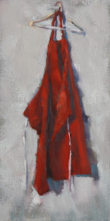
"My Apron"
14 x 7
NFS

I have shown the image of my apron before, in my post about Reds. It is such a fun and personal image, that I wanted to include it when writing about the garment series. This is my painting apron, which is the first thing I reach for when I enter my studio, and the last thing I return to its place before I leave. Why red? I inherited several of these from my late aunt and uncle. They had the red aprons specially made to wear when serving Christmas meals at their company's holiday party. It seems that everything has a story...


Monday, June 10, 2013

Inviting Interiors

"White Wicker"
12 x 12

I love to paint interiors, and have recently started a new series. The plan is to depict some of my favorite spaces, both close to home and far away. Most of them are places where I have been lucky enough to spend some time--but not long enough! It is so tantalizing to glimpse a special space, or spend a day or two there, and leave wanting more.


The painting above is a scene from the guest bedroom at a friend's house in Maine. It's one of my favorite views, surrounded on almost all sides by the water. This painting just says "Summer" to me. You can learn more about it here.


"Studio Reading Spot"
24 x 20
 
Much closer to home, the painting above is right in my own studio. I painted this one on an overcast winter day earlier this year. I was tempted to quit work, plop down on the sofa, and enjoy that cup of tea! This painting can be seen at Providence Gallery, in Charlotte.

Hope you enjoy these. There is more to come!


Sunday, June 2, 2013

Art at Home

"Pasture Scene" 
SOLD

From time to time, I get to see my paintings in their home settings. It's great to see the special relationship that can exist between the painting and the place. It's truly magic when a painting and its surroundings seem to be made for each other, and enhance each other in a way that makes the whole greater than the sum of its parts. This is what art can be all about! Here are a few shots of some favorite painting placements.


"Windows on the River"
SOLD