Showing posts with label art appreciation. Show all posts

Wednesday, March 22, 2023

Vuillard and the Silhouette

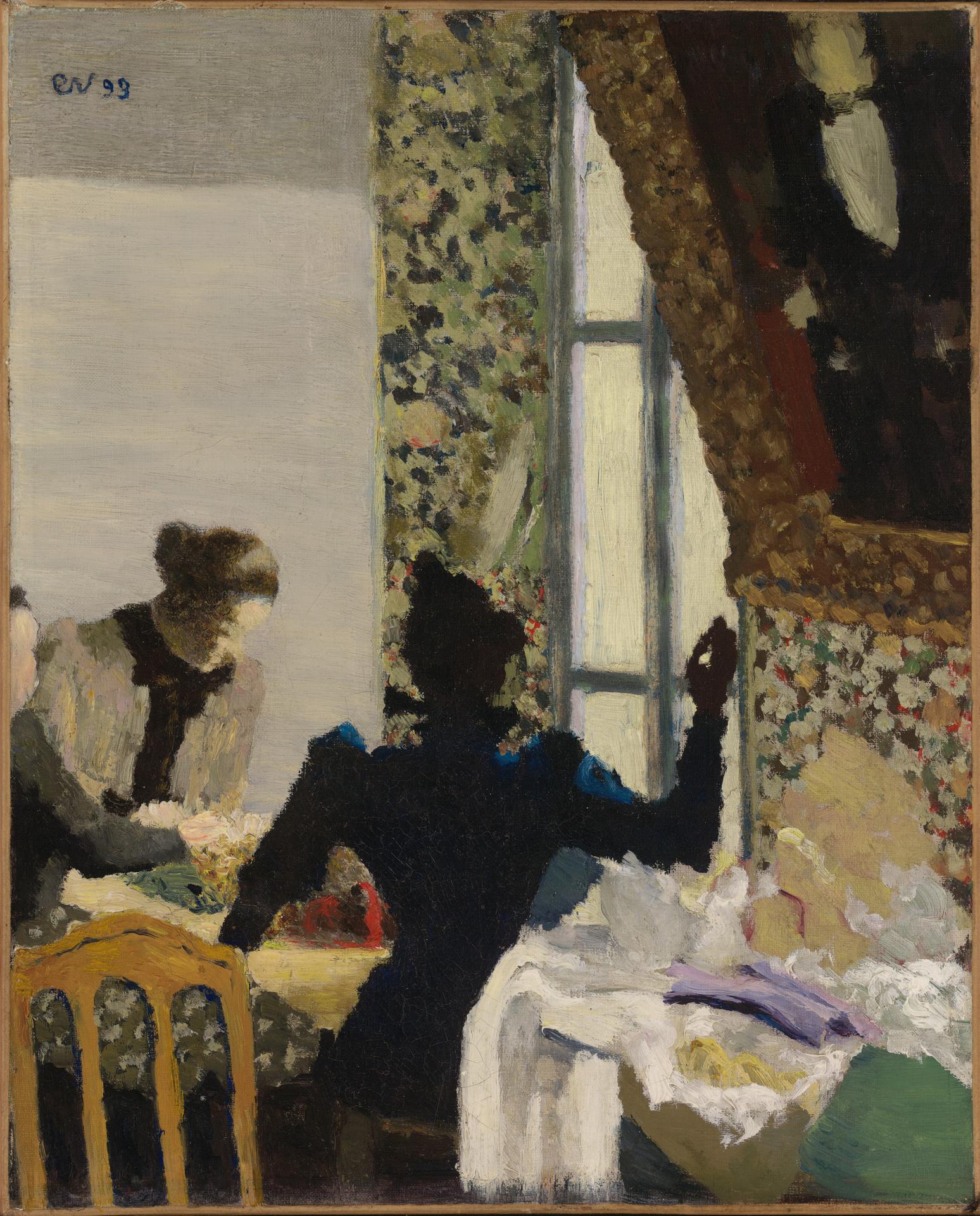
"Interior with Women Sewing"
Oil on Canvas, 15 7/8 x 12 11/16 inches
Édouard Vuillard, 1893 


Faithful readers know that Édouard Vuillard is one of my favorite painters, and one who greatly inspires me.  I've been revisiting some of his work, and exploring his use of the silhouette.  Truly masterful!  


The top image is variously called "Interior with Women Sewing" or "L'Aiguilée" ("The Needle").  Oh, wow, I can just feel that hand with the needle pulling the thread taut.  The central figure has such a strong gesture.  There are actually three women in this painting, but the silhouettes of the ones on the left serve merely to bring you eye to the main actor in the center.  It's a masterpiece of composition and sparing use of shapes.


"Beneath the Lamp"
Oil on Canvas, 12 1/2 x 15 3/4 inches
Édouard Vuillard, 1892

The next one is also full of lessons for us lesser mortals.  There is a lot of "busy-ness" in the interior decor, but the power of the two female silhouettes create unity and harmony.  There are a lot of lost edges, where the women's silhouettes fade right into the darkness of the room.  As a result, only partial silhouettes remain.  And even then, they are so powerful!  I also think the silhouettes of the chairs are wonderful compositional tools.  They define the area of interest, and bring our eye in a circle. 


"Seamstress"
Oil on Panel, 9 1/4 x 13 1/2 inches
Édouard Vuillard, 1892-95


And the silhouette doesn't need to be blackened.  This last painting shows how a simple, un-modeled figure in silhouette can anchor a painting.  Again, the interior space is replete with details and small shapes of color.  Almost dizzying to the eye.  But the solid form of the central figure holds everything together.  Such a beautiful piece of magic.

If you are interested in more about silhouettes, and especially Vuillard's, check out this post from a few years ago.  Happy reading! 


Thursday, August 18, 2022

Hidden Gem

"Bucko O' Malley"
Oil on Canvas
Robert Henri, 1924

I have just returned from a trip to Maine, and one of the highlights of the visit was the Colby College Museum of Art.  What a wonderful discovery!  Tucked away in the relatively remote small town of Waterville, this museum has a world class collection.  Little did I know!


"Frantic Flameng and Paul Helleu"
Oil on Canvas
John Singer Sargent, c. 1880

When I entered the first gallery, I was greeted by Robert Henri's "Bucko O'Malley" (top image).  Like many other painters, I consider Henri's book, The Art Spirit, a kind of bible.  Seeing this portrait by Henri was like running into an old friend.  In the same gallery was the beautiful double portrait by John Singer Sargent, "Francois Flameng and Paul Helleu".  Sargent is a master of the reds, and this painting proves the point.


"Portrait of a Child"
Oil on Canvas
James McNeill Whistler, 1885-95

I was already thinking this was an embarrassment of riches, when my eyes fell on a portrait by Mary Cassatt,  and another by James McNeil Whistler.  I learned that the Museum has the most extensive collection of Whistler's works in any academic museum.  Over 300 etchings and lithographs, and also works in other media.  Thanks to a robust website, you can see them all here.  


"Blue Umbrella"
Lithograph on Arches Paper
Alex Katz, 1979-80

The Museum's collection is not limited to old masters.  There is beautiful work by the American abstract expressionist Joan Mitchell.  And the current exhibit focuses on another American artist, who is still creating today, Alex Katz.  Katz has donated over 700 works to the Museum.  It's an amazing collection.


I know that Maine is an outdoor lovers haven.  But if you visit, try to find time for this fabulous museum.  You won't disappointed.


Thursday, March 24, 2022

Fra Angelico Reimagined

Detail from "Nolo Me Tangere", Fra Angelico


Among the many wonderful Italian painters of the early Renaissance, Fra Angelico is one of my favorites.  Though he painted his share of gilded, regal looking saints and angels, Fra Angelico's work also speaks of a more humble outlook. Even the smallest of nature's flora and fauna in his work are lovingly painted.  And the humanity of his figures is striking.


Fra Angelico, Perugia altarpiece predella

The influence of Fra Angelico echoes down the centuries, and reaches serious painters even today.  One thing that captivates me is the depth and volume of his work.  I am intrigued by the "cross sections" of structures, in which we look through arches and doorways to the happenings within.  This use of architecture is an important element in the workings of his paintings. 


"The Annunciation"
Fra Angelico, c. 1426

We can learn many lessons from Fra Angelico. I'm showing here how two different artists have interpreted some of his work recently.  I love how the painter Chris Liberti has interpreted "The Annunciation".  Liberti used the architecture of Fra Angelico's original work (above), yet adapted it as a framework for a contemporary vision. Liberti's interpretation (below) is a visual feast--completely his own, and at the same time completely comprehensive of the original.  I love the way Liberti's shapes and colors are so ephemeral, and so intertwined.  His painting is simply full of wonder.


"Fra Backyard"
20 x 20, Oil on Wood
(c) Chris Liberti, 2020

I am also taken with a recent collage by Olivia Hiester, based on another work of Fra Angelico.  With perfectly chosen shapes of color, Hiester evokes all the emotion and movement of the original painting. In fact, I think that the collage's simplification enhances, rather than detracts, from the power of the original. Hiester's cutouts recreate the fabrics' drape and fold to convey perfectly the volume and dimension of the figures. There is a solidity here that feels very earthly, despite the heavenly halos.  Olivia's work and the original fresco are below. Both lovely.


Painter Paper Collage, (c) Olivia Hiester 2022

I have read that the great artist Mark Rothko was especially impressed by Fra Angelico's frescoes at the Convent of San Marco in Florence, Italy.  Rothko was so taken by the "inner light" of the frescoes that he is said to have developed a special chalk mixture that he could use on canvas, in order to achieve a similar luminosity. I conclude with Rothko's painting, said to spring from this experience.  Long live Fra Angelico!  


"Untitled, 1950", Mark Rothko


Monday, March 14, 2022

Pentimento


Pentimento:  it's an Italian word, meaning "repentance".  In the art world, it refers to marks and areas that have been superseded and worked over, but which still can be discovered in the finished work.  One might say that the artist "repented" of his original marks, and made changes to them. Some pentimento is not visible to naked eye, and is only found via X-rays or infrared scans.  A famous example is in Jan van Eyck's painting shown at the top of this post, in which he reworked one of the male figure's hands.


"Seated Nude, 1966:
Charcoal on Paper, 33 x 23.5 inches
Richard Diebenkorn, 1966

But the pentimenti that most interest me are those which are intentionally left visible in the final artwork.  I find it fascinating to see these marks, because they show the thought process and the myriad decisions made by the artist during the creation of the work.  Sometimes these pentimenti are drawing marks left visible, and other times they are actual changes to the composition.  


"J.A.D.I., 1966"
Charcoal on Paper, 25 1/8 x 19 inches
Richard Diebenkorn, 1966

Richard Diebenkorn was a master at revealing, rather than hiding, his process.  As Thomas Larson wrote in Art Revue Magazine, Diebenkorn's "expressions of form and color collect and compound the residue of the many impulses it takes him to complete (or abandon) a painting.  No other American artist has kept the covered over decisions which make a painting as Diebenkorn has, and made them his unmistakable style."


Ocean Park No. 79
Oil on Canvas, 93 x 81 inches
Richard Diebenkorn, 1975


Diebenkorn famously said that he intentionally did things wrong at first, in order to set them right later.  For him, the process of making art was a process of correcting, and the correcting was joyful.  No wonder his work embodies the magic of pentimento!  His two charcoals shown above are intriguing for their searching lines. The mark-making shows Diebenkorn's journey of discovery as he explored the motif.  His large abstract Ocean Park paintings (such as the one immediately above) are also layered with shapes and colors that are applied, then abandoned and painted over.  The surface texture of the canvas speaks of the accumulation of time, and of the many decisions that have been made and revisited, over and over again.  I for one like to see this evidence of the painter's struggle--it makes me appreciate the hard fought battle of painting.  Enjoy!


Wednesday, January 19, 2022

Our Artist Ancestors


"Blue Sky in Pimlico" 
Oil on Wood, 61 x 45.7 cm.
Patrick George, early 1980's


It's been said that when you are drawn to the work of a particular artist, and want to learn more about their approach, you should not study the work of THAT artist, but rather the work of the painters who influenced them. In other words, look at their artistic grandfathers, and great-grandfathers.  Taking this advice to heart, I have enjoyed tracing the family tree of living artists whose work I admire.  Many lines lead back to Patrick George, and George's mentor, William Coldstream.  For today, I'm looking at Patrick George (1923-2016).


"Jampot Tree with Two Horses"
Patrick George

My research on George led me to a wonderful little book of his writings.  It's entitled The Likeness is in the Looking.  George taught at the Slade School of Fine Art in London for forty years, and the book includes some of his lectures and teaching notes. It also includes entries from his diaries.  What a rich way to get into the thoughts of a wonderful painter!


"Hilary Lane Night Portrait"
Oil on Canvas, 106 x 91 cm.
Patrick George, 1965-6

If you've never heard of Patrick George, it's partly because he was a modest man, who focused more on his paintings than on self-promotion.  He lived in the English countryside in Suffolk, and loved to paint the local landscape. His obituary in The Guardian in 2016 called him one of the art world's best kept secrets.  It noted that "he was celebrated for his devotion to the particularity of things, especially trees, and English light and atmosphere".  But he also painted wonderful portraits, as you can see above.


"The Wood at Delmer's"
Patrick George

I love this quote from one of George's letters: "Could there be a better way of passing the time than sitting in a field surrounded by the intense concentration of nature...?  We paint because it is all marvelous to look at, that's why."  George liked to look, and he painted what he saw. He was keenly aware that his position vis a vis the motif was key, and that no place else would do, or ever be the same.  The shapes and patterns he saw, and their translation into paint, are simply breathtaking.  At least to me they are.  

"Valley Landscape", Oil on Canvas, Patrick George, 1965


George's teaching notes refer to the desirability of "unpredictable shapes". In fact, those unpredictable shapes are part of "accuracy".  As is "a definite particularity".  He emphasizes "Seeing shapes as shapes, rather than linear boundaries".  There are so many nuggets that I want to write down and tape to my studio walls as mantras.


Patrick George


This post is illustrated with George's paintings.  I will let the paintings speak for themselves, because it can be very hard to write about paintings.  As George himself observed, "Lectures are made from words, and paintings are not made from words."  Enjoy looking.

PS for the curious:  Mr George says that two of his "painting ancestors" were Durer and Rubens.  Ideas for delving back further into art history!


Tuesday, September 21, 2021

An Unlikely Pair

"Study for Homage to a Square"
Josef Albers

"Still Life with White Bottle and Small Bleu Bottle"
Giorgio Morandi, 1955

I have an affinity for art exhibits that pair two artists, and allow for a "compare and contrast" analysis between them.  Quite often these shows feature artists who knew each other, or influenced each other.  Now along comes a very unlikely pairing: the Zwirner Gallery in New York has mounted a show featuring two dramatically different painters:  Josef Albers and Giorgio Morandi.  At first, it seems like a true odd couple.  I feel sure these two never met, and their paintings are worlds apart.  But the subtitle of the show reveals the common thread:  "Never Finished".  


"Study for Homage to the Square"
Josef Albers, 1954

Each of these painters spent decades--perhaps his entire career--exploring one single motif. For Albers, it was the "Homage to the Square", in which a series of square shapes are fitted into each other.  The colors of the squares are carefully calibrated and practically vibrate off one another.  For Morandi,  the motif was a collection of still life objects that he observed and scrutinized obsessively in his studio.  Those everyday objects took on a universal, even majestic, stature in his paintings. They served as a springboard for deep exploration of perception, color and space.


"Natura Morta (Still Life)"
Giorgio Morandi, 1954

Further contrasts are evident. Albers worked in intense, deeply saturated colors.  Morandi worked in subtle, muted colors.  Albers' paintings are nonobjective, pure color fields.  Morandi's paintings are quite the opposite, focusing on arrangements of objects, and the way they occupy space. 


"Study for Homage to the Square"
Josef Albers

Exactly because of these contrasts, rather than in spite of them, the show has been an acclaimed success. One reviewer has said, "To my amazement, viewing them together electrifies, as their works' extremes play off each other.  Think of it as a pas de deux of a drill sergeant (Albers) and an enchanter (Morandi).  There's a crackle in perception when you turn from works by one artist to those of the other." (Peter Schjeldahl, in The New Yorker).  


"Still Life with a Bottle"
Giorgio Morandi

You can see a video of the show, and some enlightening conversation about it, by clicking here.  And other good news--a catalog of the exhibit will be released in November.  Check it out here.  Much to savor!


Friday, May 28, 2021

Summer Reading 2021


Memorial Day signals the start of summer life.  And with summer comes summer reading!  How well I remember those lazy, hazy days of summers past, when "pleasure reading" took the place of textbooks.  In case you are looking for ideas on what to read next, I thought I'd share a few thoughts. Art themed, granted, but these books are not just for artists.


I just picked up a copy of "Spring Cannot be Cancelled", hot off the press, about David Hockney's COVID spring in Normandy.  Hockney used the lockdown at his farmhouse in Normandy as an opportunity for enhanced devotion to his work.  The book comes highly recommended by a good friend, and reviews are very positive.  The dust jacket flap calls it "an uplifting manifesto that affirms art's capacity to divert and inspire." I can tell just by thumbing through my copy that it is rich with art history, as well as personal reflections of Hockney.  Can't wait to dig in!


"Art & Fear: Observations on the Perils (and Rewards) of Artmaking" is a classic that has been around for a while, but never grows stale.  The authors discuss the fears and pitfalls that haunt artists of all types (musicians, photographers, painters, sculptors, etc).  I just read it for the second time, and I think it contains life lessons that are broader than just the arts.  Worth a read, especially if you are working in one of the "arts" fields.


I can also recommend from personal experience "The Man in the Red Coat" by Julian Barnes.  Published just last year, it's a very current read.  The book is an amusing and enlightening romp through Belle Époque Paris, in the company of Dr. Pozzi and his friends.  Think Henry James, Oscar Wilde, Proust, Whistler and other characters of the day.  Dr. Pozzi is the man pictured below, in Sargent's famous painting.  Julian Barnes has a way with words, and his wit and insight make this heyday era in Paris spring to life.  Enjoy!


Wednesday, April 21, 2021

A Fine Line

"Bateaux aux Martigues"
Felt tipped pen on paper, 33 x 40.5 cm.
Nicolas de Staël, 1954

I have recently been taking a drawing seminar, and it has led me to look at a lot of drawings by masters of years past.  I love seeing fully "modeled" drawings, don't get me wrong.  But there is something especially exciting to me when a single line makes all the right moves.  How can some artists say so much with so little?


"Study of a Nude"
Pen and China Ink on Paper
Nicolas de Staël, 1952-53

Faithful readers know that one of my favorite artists is Nicolas de Staël.  I'm illustrating this post with some of his drawings, in which a mere line creates an entire world.  Interestingly, de Staël used a felt tipped pen to create many of these works. It just goes to show that sometimes great art can come from very humble materials! I can imagine de Staël sitting with a drawing pad and pen, and distilling the chaos of the world around him into a few tell-all lines.


It might appear as if these drawings were dashed off quickly or haphazardly.  In fact, the opposite is true. As Nicholas Fox Weber as written: "With de Staël, even the shortest dash is the result of a conscious decision.  It would not be there if the measure were not perfect, and if it did not fit as an essential in the overall scheme."  I am also struck by the way de Staël uses the white (blank) space of the picture plane.  The line may be the only visible mark, but it also defines the invisible shapes that we know are there. For example, in the first drawing above,  the boat hulls sit in the top of the picture plane--and the space below them, though "blank", teems with the movement of the water.


Nicolas de Staël

The bouquet of flowers (shown just above) stopped me in my tracks the first time I saw it.  And it sill makes me catch my breath. Oh, such clarity!  Weber writes of a similar floral painting that de Staël   "caught that bouquet of flowers as a mass of angles in space."  And a great catch, at that.  Hope you'll enjoy these drawings as much as I do.


Thursday, December 10, 2020

Red All Over


"Dr. Pozzi at Home"
79.4 x 40.2 inches, Oil on Canvas
John Singer Sargent, 1881


I've been thinking a lot about RED. Maybe it's because I just finished reading Julian Barnes' new book, The Man in the Red Coat.  The book is an amazing and entertaining romp through Belle Epoque Paris with Dr. Samuel Pozzi, the subject of the top photo.  The painting of Dr. Pozzi by John Singer Sargent is huge (larger than life-size) and powerful. I have actually seen it in person. If ever there was a painting that called for the word "scarlet", this is it.


"Robert Louis Stevenson and his Wife"
20 1/2 x 24 1/2, Oil on Canvas
John Singer Sargent, 1885

In the world of painting, the color red is a "dark".  That is, at its most intense, it does not reflect much light.  This feature can make red pigments difficult to use successfully.  I am intrigued by paintings that are "red all over"--working with very subtle variations in hue to achieve their purposes. Sargent was a master of this, as was Anders Zorn (see below).


"Mrs. Howe"
Anders Zorn, 

It's one thing to paint a portrait when the subject is clothed in red.  'Tis a horse of a different color to take a more neutral scene and amp up the heat by couching it all in red.  The interior pictured below by Connie Hayes does just that.  And beautifully. 


"Light Witness"
20 x 20, Oil on Canvas
(c) Connie Hayes

And while we're at it, I can't overlook those red flowers by Nicolas de Staël.  Hot!  Hope you'll enjoy this exploration of the reds to warm you up on a winter's day!

"Fleurs Rouges"
Nicolas de Staël


Thursday, January 16, 2020

Why Bother?

Lesley with Diebenkorn
I recently visited The Phillips Collection in Washington, D.C. The impetus for my visit was the special exhibit "Bonnard to Vuillard: The Intimate Poetry of Everyday Life." And it did not disappoint! I broke one of my usual rules, and allowed myself to study the exhibition catalog in advance of my trip. Comparing my experience with the catalog to that of my in-person  visit, I was struck by the rewards I got from making the effort to go to the show in person. In today's world where almost everything can be done "virtually", why bother to go in person? Read on for my top three reasons.


Visiting the Nabis Exhibit


1.  You can't appreciate the scale of a painting from an image in a catalog. Paintings presented on the pages of a book are necessarily of somewhat the same dimensions. After all, a page is only so large! It would be far too distracting to show a person standing by each painting in order to show its relative size. We can read the actual dimensions in the descriptions of the paintings, but even knowing that information doesn't convey the "feel" that we get from confronting the painting in person. A small painting encourages you to step close, to peer in. A huge painting encourages you to step back, to let the whole of it wash over you. Just look at the dramatic difference is scale between the Diebenkorn painting at the top of this post, and the Nabis' paintings following it. Two different worlds!


"The Door and the Sewing Table"
Oil on Cardboard, 16.75 x 17.5 inches
Édouard Vuillard, c. 1900

2.  Reproductions don't show the true colors of the original. Even though we have wonderful new technologies for reproducing images, the reproduced image just cannot tell the real truth of the original. Oftentimes the reproduction comes very close to the original, but falls slightly short. Occasionally the reproduced image is so poor that it doesn't even seem like the same painting as the original. The catalog for the Nabi exhibition is a wonderful one, with excellent quality images overall. Even so, there are exceptions. For example, one of my favorite paintings in the exhibit was the one pictured immediately above. I swore to my husband that I had not seen it in the catalog--I was adamant that it was definitely NOT in the catalog. Upon returning home and consulting the catalog, I found that it was in fact pictured there. But the reproduction was so far off the mark that I didn't even recognize the painting. See the reproduction below (photo from the catalog). I rest my case.


Reproduction of Vuillard

3. A well curated exhibit places the paintings in a context that enhances your enjoyment and appreciation of the artwork. No question about this. I have attended exhibits that were so well staged that I felt as if I had entered a time machine and had been taken to the painter's world. The Anders Zorn retrospective in Paris is one that comes to mind, and I tell you why here. The Nabi exhibit at The Phillips was in that same category. Because the Nabis believed that art should be part of everyday life, they created not only paintings, but also decorative items such as stained glass, screens, tapestries, and vases. The Phillips included all of these types of objects. The curators went even further, and wallpapered some of the gallery spaces to reflect the style of the Nabis' era, and the nature of the interiors they painted.  I'm including an example below. The colors, the textures and the placement of the art evoked the decade of the Nabis at their zenith. A great job!


Gallery in the Nabis Exhibit, The Phillips Collection
If you can get to Washington for the Nabis exhibit at The Phillips, it's worth a journey. The show runs through January 26, 2020. If you've been, or if you go, let me know what you think!


Sunday, December 1, 2019

Going Public


"Passerby"
Oil on Cardboard, 7 7/8 x 11
Félix Vallatton, 1897

Whenever I visit a special exhibit at a museum, I always catch my breath to see a previously unexhibited painting that is on loan from a private collection. Such a rare treat! I marvel at the luxury it must be for those private collectors to live every day with paintings by Manet, or Bonnard, or Vuillard--right there in their dining rooms. 


"Yellow Gable"
Oil on Cardboard, 11 7/8 x 10 5/8 in.
Maurice Denis, c. 1895

Occasionally, through the great generosity of a collector, an entire collection comes into the public realm (rather than being parceled off and auctioned to private purchasers). One such occasion is being heralded now, at the Phillips Collection in Washington, D.C. The Nabis collection of Roger Sant and his late wife Vickie Sant has been pledged as a future gift to The Phillips Collection, and the works are now being shown in a special exhibit that runs through January 26, 2020. The exhibit is entitled "Bonnard to Vuillard: The Intimate Poetry of Everyday Life".


"Apprentices"
Oil on Cardboard, 12 x 9 in.
Édouard Vuillard, c. 1891-92

You don't have to have been reading this blog very long to know how much I love the Nabi painters, and especially Vuillard and Bonnard. The Nabis were a loosely organized group of avant-garde French painters working in the 1890's. They rebelled against the old-line, classical academies of art, as well as against the new-fangled Impressionists. 


"Street Scene"
Oil on Cardboard, 10 1/4 x 133/8 in.
Félix Vallotton, 1895

Although their styles were diverse, the Nabis were united by certain common factors. Their paintings tended to focus on scenes of domestic life, and they employed abstracted shapes of vibrant color. They often disregarded the rules of vanishing point perspective, so that their scenes were "flattened" into into an arrangement of color patterns. In fact, the words of one of the Nabis, Maurice Denis, became a sort of rallying cry for the group:


Remember that a painting--
before being a bottle horse, a nude woman,
or an anecdote of some sort--
is above all a flat surface
covered with colors
arranged in a certain order.

"Sleeping Woman"
Oil on Cardboard, 10 1/2 x 10 1/2 in.
Édouard Vuillard, 1892

The term "Nabi" is from the Hebrew word for prophet. Some say that these painters paved the way to what we know today as modern art. And yet their diversity and the quickly changing times led to an early disbandment. The Nabis held their final exhibit in 1900, and then went their separate ways, each going on to develop his own style and body of work. But the Phillips exhibit shows the group at its zenith.  I can't wait to see it.  If you can't make it to the exhibit, the book that accompanies the exhibit is excellent--well worth a look. We all owe a debt of gratitude to the Sant family for this transformative gift.

PS: It seems that the Nabis are having "a moment"--another Nabi, Félix Vallotton (some of whose works are pictured above), is the subject of a major current exhibition at the Metropolitan Museum in New York....