Showing posts with label process. Show all posts

Tuesday, January 17, 2023

Sketchbook Inspiration

Double Page Spread from Prendergast Sketchbook


Every year I resolve to be more faithful in my sketchbook practice.  This year, I have fueled enthusiasm for my resolution by revisiting another artist's sketchbook--one that was kept by Maurice Prendergast around 1899.  I happened on this little treasure in a used book store, and couldn't resist bringing it home.  It's an exact reproduction of the actual sketchbook kept by Prendergast.  (The original has been donated to the Boston Museum of Fine Arts).  My book lay fallow for a while, but when I eventually delved in, I was delighted.


From Prendergast Sketchbook, 1899


The pages in the Prendergast book are a delight of color and motion--as the accompanying material says, "fleeting impressions of...women  in holiday garb...the edge of the sea, sunlit parks and woodlands....gay parasols over extravagant bonnets".  The Gilded Age, indeed!  The book has both watercolors and pencil drawings.


Interestingly, a number of the watercolors were painted on separate sheets, and afterwards attached to the pages of the sketchbook.  I felt a kinship with Prendergast when I learned that--it sounded like something I might do, rather than plunging right into the sketchbook itself.  Was he cautious about wasting pages of the sketchbook on drawings that didn't work out?  Did he choose the watercolors to attach to the sketchbook because they were the most accomplished (leaving out the rejects, so the book would be pretty)? Or did he choose them because they were seeds of ideas for further paintings, and he wanted to keep them front of mind, and close at hand?
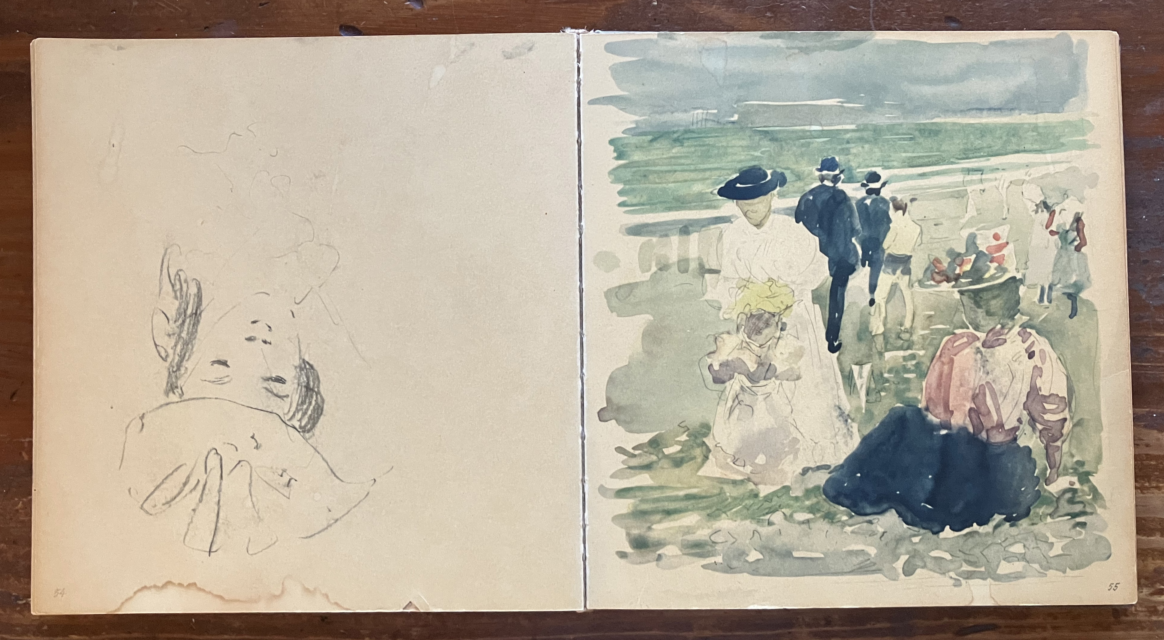


Nevermind the answer to those questions.  The important thing is the practice of keeping the sketchbook. I did some further research online, and was especially inspired by Prendergast's sketches from Paris, like the top image in this post.  I'm planning a trip to Paris this year, and the sketchbook will definitely go with me.  Mine may never be part of a museum collection, but it will still be a treasure to me!


Wednesday, June 8, 2022

Supersizing

Untitled
12 x 12, Oil on Linen
(c) Lesley Powell 2022


One of my favorite books about painting is an old classic, Carlson's Guide to Landscape Painting by John Carlson.  Some of the material is copyrighted as early as 1929--almost 100 years ago!  But the advice is timeless.  


Untitled
30 x 30, Oil on Canvas
(c) Lesley Powell 2022


Carlson's students painted mostly small to mid-sized paintings.  But he urged them to occasionally take on a large canvas. He said that facing a large expanse of clean canvas gives the painter a sense of power.  However, he cautions that one MUST organize and draw and paint well when working in a large format.  In his words, "A large pictures shows up ANY lack whatsoever.  What was (in a small sketch) a tree, made with one touch of green paint, becomes on a large canvas a formidable mass that requires construction."  Therein lies the struggle!


"Lavender Fields"
30 x 30, Oil on Canvas
(c) Lesley Powell 2022

I have recently painted several 12 x 12 inch canvases.  I love that size, and feel very comfortable with it.  So I decided to take some of the ideas expressed in that format and go bigger.  Hence the title of this post, "Supersized".  As a result of my work, I can definitely vouch for this statement by Carlson: "Any fault of composition shoots out with cruel obviousness from a large canvas."  A slight inaccuracy might be acceptable in a small work, but it is glaringly (or in Carlson's words, "cruelly") obvious in a large format.  Care is the watchword.


Untitled
30  x 30, Oil on Canvas
(c) Lesley Powell 2022

I'm illustrating this post with some of my recent efforts in the large scale format.  The top two images are a great illustration of what happens to me taking a small image to a large format.  The top image is the 12 x 12 canvas.  The second is the 30 x 30 rendition of the same subject.  Vive la difference!


Wednesday, May 18, 2022

Paper, Explained

"Peonies in Bud Vase"
12 x 8, Oil on Paper
(c) Lesley Powell 2022


In response to my latest newsletter, I have had lots of questions about how to frame or display works on paper.  There are more options than you might think.  Mounting, matting, glass, no glass....read on!


"Peonies, Back to Back"
9 x 6.5, Oil on Paper
(c) Lesley Powell 2022


First, about the paper.  There are several brands of paper that are specially milled and treated to accept oil paints.  The artist doesn't need to do anything extra to prepare these--they arrive ready to work on.  Another option is to prepare your own paper support.  I often use BFK Rives print-making paper.  I prepare it with two coats of shellac, which keeps the oil from permeating the paper.  It makes a wonderful, smooth surface.  You can do the same thing with sturdy multi-media paper, or watercolor paper.


Now, to the finished painting.  One option is to mat it.  I leave a nice margin around the painting, so a mat can go on without covering any of the subject.  You can cut the mat to a standard size, which enables you to buy a ready-made frame for it (thus saving money!). 


Do you need to put glass over the matted painting?  No.  I can be framed sans glass. But you can use glass if you want to.  Just be sure that the glass is not actually touching the painting.  A mat is typically thick enough to keep the glass spaced off the painting.  The image just above is a painting on paper by Erin Gafill that I bought and matted, then framed under glass.


Another option is to mount the painting on panel. The panel is first primed with an acrylic primer to prevent discoloration. I often mount paper on a flat panel (as immediately above), which allows for a number of frame options.  I have recently mounted the paper on a cradled panel (shown below), so that it can be put in a floater frame.  This makes for a really nice look.


Bottom line:  Don't be afraid of paper!  And feel free to contact me with any questions--I'll try to find the answers!


Wednesday, April 20, 2022

Fast is Fine


Faithful readers know that quotations are sprinkled liberally throughout this blog. Some are worth revisiting, and this is one:

"Fast is fine,
but accuracy is final.
You must learn
to be slow in a hurry."

The words are attributed to none other than the famous gunslinger of the Wild West, Wyatt Earp. You can imagine what he meant when he said that accuracy was "final". 


This quote seems especially instructive in the context of plein air painting. When painting outdoors, many things (light, clouds, temperature) are constantly changing, and the painter has to work fast. But being fast is not enough--the painter must also get the right colors, in the right shapes, in the right places on the canvas. It's always a eureka moment when you put down just the right stroke of paint--it works!--and you can lay it and leave it. That's what I'd call accuracy in painting.

"Quiet Hamlet"
12 x 8, Oil on Linen
(c) Lesley Powell
(SOLD)

But how do we achieve that accuracy? By being "slow in a hurry". It's a great example of a paradox--it appears to make no sense, but it actually holds a powerful truth. While working very  quickly, the painter must still take time to look deeply, to analyze what he sees, to compare each color to the next.  In other words, he must slow down enough to make careful decisions, but still work at a hurried pace. Doing things quickly isn't very helpful if you're not doing the right things!

"Atmospheric Hills"
7 x 14, Oil on Linen
(c) Lesley Powell 2019
(Available)

And how do you go "slow in a hurry"? I suspect it has  to do with sustained practice--repeating certain challenges so often that the approaches to them become second nature. Such practice allows us to develop painting skills that become almost instinctual. They become part of our artistic DNA. They can be summoned in an instant.  When we slow down to make the decision about the next brushstroke, the decision can be taken relatively quickly. And the entire series of decisions can be made in a hurry. And so we "go slow in a hurry".  A useful goal to keep in mind.

"Paris Pont"
10 x7, Oil on Carton
(c) Lesley Powell 2019
(SOLD)

I'm illustrating this post with a few favorite plein air paintings from my archives.  These are the miraculous ones  that came together completely in the field, and required no adjustments back in the studio. Final!


Thursday, April 7, 2022

21st Century Reducing Glass


Photo: Ewan McClure


I have written previously about the reducing glass (pictured above).  It is the opposite of a magnifying glass--it can be held up to a painting to reduce a large area to a small view.  The idea is that is helps you see the work as a whole, in one glance, rather than getting caught up in details.  The reducing glass has been an artist's tool for decades (maybe centuries?).


Photo: Art Apprentice Online

Now along comes the smart phone, complete with digital camera.  There are a lot of apps that painters can use on their phones, from value finders to composition grids and more.  Personally, I don't use any of those.  But I do use the camera on my iPhone as a modern day reducing glass.  One quick click, and a 30 x 40 inch painting appears on the phone as a 2 inch image.  Quite amazing, really.  Check out how it works with the two images below.


It is astonishing what you can learn when your painting is reduced to a thumbnail size like this.  You can quickly see the major masses or shapes, and the overall pattern of lights and darks.  Those are the things that make or break a painting!  Yet so often we get caught up in drawing a tree or a fence that we lose track of the big picture.  Camera (aka "reducing glass") to the rescue! (There is a life lesson here.  Something about seeing the forest for the trees...).


And I might add:  how many times have I thought a painting was completed, but when I photographed it for my website, and looked at the image on a little digital screen, I saw a glaring problem?  Countless times!  Then it's always back to the easel.  I think we should all add the smart phone camera to our list of favorite studio tools...

Monday, March 14, 2022

Pentimento


Pentimento:  it's an Italian word, meaning "repentance".  In the art world, it refers to marks and areas that have been superseded and worked over, but which still can be discovered in the finished work.  One might say that the artist "repented" of his original marks, and made changes to them. Some pentimento is not visible to naked eye, and is only found via X-rays or infrared scans.  A famous example is in Jan van Eyck's painting shown at the top of this post, in which he reworked one of the male figure's hands.


"Seated Nude, 1966:
Charcoal on Paper, 33 x 23.5 inches
Richard Diebenkorn, 1966

But the pentimenti that most interest me are those which are intentionally left visible in the final artwork.  I find it fascinating to see these marks, because they show the thought process and the myriad decisions made by the artist during the creation of the work.  Sometimes these pentimenti are drawing marks left visible, and other times they are actual changes to the composition.  


"J.A.D.I., 1966"
Charcoal on Paper, 25 1/8 x 19 inches
Richard Diebenkorn, 1966

Richard Diebenkorn was a master at revealing, rather than hiding, his process.  As Thomas Larson wrote in Art Revue Magazine, Diebenkorn's "expressions of form and color collect and compound the residue of the many impulses it takes him to complete (or abandon) a painting.  No other American artist has kept the covered over decisions which make a painting as Diebenkorn has, and made them his unmistakable style."


Ocean Park No. 79
Oil on Canvas, 93 x 81 inches
Richard Diebenkorn, 1975


Diebenkorn famously said that he intentionally did things wrong at first, in order to set them right later.  For him, the process of making art was a process of correcting, and the correcting was joyful.  No wonder his work embodies the magic of pentimento!  His two charcoals shown above are intriguing for their searching lines. The mark-making shows Diebenkorn's journey of discovery as he explored the motif.  His large abstract Ocean Park paintings (such as the one immediately above) are also layered with shapes and colors that are applied, then abandoned and painted over.  The surface texture of the canvas speaks of the accumulation of time, and of the many decisions that have been made and revisited, over and over again.  I for one like to see this evidence of the painter's struggle--it makes me appreciate the hard fought battle of painting.  Enjoy!


Sunday, October 10, 2021

Making my Own


For all you painters and art collectors, I want to share this information on how I make many of my own painting surfaces.  I love to paint on Belgian linen, and I often paint in non-standard sizes.  As a result, it is an important factor in my work to have custom supports.  Here's how I do it:


Photo #2


I often paint the painting on "loose" linen, just clipped to a board.  If the painting doesn't work out, I can wipe it down and start over.  If the painting DOES work out, I then mount it on a wood or MDF support.  (Incidentally, these woods are getting harder and harder to find in the post-COVID world).  The top photo shows a finished painting on loose linen, and the panel my husband custom cut for it.  (Not shown:  I treat the board with a coat of primer such as GAC 100 before mounting).  


Photo #3

Next I loosely place the painting on the panel, and move it around until it is centered.  That is the trickiest part of the entire process. Once I'm happy with the placement, I mark the back of the linen to show that placement (Photo #2).  Next I get out my trusty acid-free, archival adhesive.  Usually I use YES paste (Photo #3).


Photo #4

I spread the YES Paste thinly on the panel and also on the back of the linen, using a flexible palette knife (photo #4).  It's a lot like icing a cake.  When that is done, I press the painting down onto the panel and smooth it out with my hands.  Then I press it again using a rubber brayer, working from the center out to the edges, to make sure that any air bubbles are gone and that the linen is securely and evenly attached to the panel (Photo #5).


Photo #5

Finally, if I have been smart enough to leave a good margin of linen (like I did for this example), I wrap the linen around the panel (Photo #6).  Wrapping it around gives a wonderful finished edge to the painting, and allows the painting be to displayed unframed and still look very "finished".  It also allows the painting to be "floated" in a frame, without exposing any raw edges.  


Photo #6

One last step not pictured here: I put the painting face down under a pile of heavy books overnight, to allow the paste to dry and the seal to bond.  And the next morning, VoilĆ !  An uber-custom painting, ready for its close up!  It's a pretty involved process, but the result is well worth it to me.  Enjoy!


Wednesday, May 5, 2021

Progress!


 The peonies in my little garden have flowered, and I could not resist taking a vase of them to the studio to paint. The bloom season is very short--but a painting lasts forever!  I thought it might be fun to share a few photos showing how the painting materialized.

Top shot:  I "blocked in" the big shapes.  At this first step, the most important things to me are (1) getting the big shapes in approximately the right place on the canvas, and (2) paying attention to which shapes are in light and which are in shadow.  The shadow shapes are toned in a fairly deep blue-ish color. If I'm not excited by what I'm seeing at this point, I don't proceed.


Next step:  I paint the background.  As painting instructors say, one should "paint the SPACE around the thing", rather than painting the thing itself.  Getting the color down accurately for the area behind the flowers tells the viewer where the flowers are located in space.  It makes the painting believable.  Plus, notice how the painting almost seems to paint itself once this is done.  Sometimes I wish I could stop here and let my mind entertain all the possibilities, without having to commit to any one of them.


Third step:  Trying not to mess up the magic of the underpainting.  This is the hard part: keeping room for the imagination, and deciding which parts are important to emphasize.  It's a battle between the general and the specific.  I definitely don't want to draw each petal!


Fourth:  Stopping point.  I've worked far enough through the prior steps to stop for a while.  I'll let it sit for an hour or two, or a day or two, and see whether it feels finished.  The key from here on out is to avoid the temptation to fiddle and fuss so much that the freshness is destroyed.  Wish me luck!


Tuesday, January 19, 2021

Starts


The New Year seems like a good time to write about STARTS.  Specifically, those first steps that constitute a start on a painting.  Approaching a blank canvas can be intimidating--even terrifying!  Making those very first marks is an important moment. Sometimes I even begin by painting over an old painting, so I have something to "work against", as you see directly below.


What happens at the start? It is pure magic! You are laying in shapes and forming the composition. You can see the picture coming to life on a blank slate. It happens very quickly, with every stroke serving as as an overture to the next. The future of the painting is nothing but possibilities--nothing has gone wrong yet! These are moments of high excitement, no question.


I experiment with different methods of starting.  Sometimes I use a fine brush to draw with lines.  Other times I tone the entire canvas with a thin dark paint (thinned with mineral spirits), and then rub it off to create an underpainting. I also experiment with toning the canvas different hues, as you can see from these photos.

In any approach, a good start makes makes me excited about the future of the painting. On the other hand, a bad start is very hard to overcome, and in my case usually means that the entire painting will be a big struggle, probably not ending well. If you make a bad start, you fare better to simply wipe it off, and make a whole new start. Thank goodness that the oil painting process makes that entirely possible! 


I'm illustrating this post with examples of some "starts".  A few of the finished paintings are already up on my website, for the curious: https://www.lesleypowellart.com


Tuesday, January 5, 2021

The Learning Curve


Every serious painter knows this hard truth:  there are many stumbles on the path to improvement, and you must be willing to fall, and then pick yourself back up and start over. Progress can be sporadic (and that's an understatement). Many hours must be put in. Courage and perseverance are key.


I reflected on this truth while reading an article that discussed how babies learn to walk. Toddlers learning to walk are so determined that they travel the length of about eight football fields in ONE HOUR. During that hour, they fall an average of 30 times. It takes 2.6 million steps for them to become proficient at walking. As the article notes, this failure rate would be deeply discouraging (the article even said "catastrophic") for an adult trying to learn a new skill. 

Toddlers persevere in learning to walk because faster, hands-free mobility is thrilling.  Adults persevere in our endeavors because mastery of a new skill is nirvana. 


Toddlers also teach us that learning is not linear.  They often start to walk, and then revert to crawling for a while. Their progress is U-shaped.  In other words, when learning a new skill, we often get worse before we get better.

Another important lesson from the article is that infants learn best "when operating near the limits of their current skill level."  The takeaway for the rest of us is clear:  Always be "at the edge of what you can't currently do."  


"After Degas"
12 x 10, Oil on Linen
(c) Lesley Powell 2020

I've written about the creative process before, and the example of toddlers learning to walk reinforces some of the notions I explored then. It's a nice concrete example to keep in mind as we start the New Year.  Yes, it's frustrating to be at the edge of what you can't currently do--but oh, the rewards are great when you can push that boundary a little bit further!


Thursday, September 3, 2020

Uncovered


Sometimes it's very hard to know when a painting is finished.  I study the canvas carefully, over a few days (or even weeks), constantly asking myself whether there are aspects that could be improved, or areas that need to be corrected.

I'm not alone in this struggle. Even the greatest artists of all time have been known to go back and make revisions--sometimes even after the painting has left the studio!  I have written about this phenomenon before, because I find it fascinating. But a recent discovery has prompted me to return to it now.


This time the tables are turned: It's not the painter who made the late-breaking revisions, but rather an unknown subsequent owner.  A painting by none other than the great Dutch master Johannes Vermeer has been determined to have been altered long after Vermeer's death. 


Experts have known for about 40 years that the original canvas featured a large Cupid on the (now plain) back wall.  But they believed that Vermeer himself was the one who had painted over it.  Recently, it was determined that the overpainting of the Cupid had happened decades after Vermeer's death. So now the experts are painstakingly removing the overpainting, to restore the canvas to the state in which Vermeer intended it. The middle image above shows the painting in mid-restoration.

I for one will miss the quietude and serenity of the light on that simple back wall. But presence of the Cupid does tip us off that the letter being read is probably a love letter.  So something is lost and something gained.  I'm staying tuned for the final reveal. And I would love to have been a fly on the wall to learn why the owner of the painting decided to have it altered!