|
| Zorn portraits at the Petit Palais Photo (c) Lesley Powell 2017 |
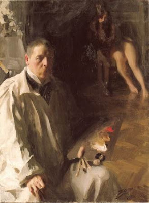
At the risk of having too many posts this year about Anders Zorn, I am compelled to report on the Zorn retrospective now running at the Petit Palais in Paris. In my opinion, this show is unquestionably a WOW. As much as I have admired Zorn's work in books and online, I was not prepared for the impact of seeing them in person. The experience reminded me once again why it is worth the time and effort to visit museums: there is simply no substitute for seeing a work of art in person. Here are some of my takeaways:
 |
| Photo courtesy of the Petit Palais |
(1) Fantastic job by the museum in staging the exhibit. The lighting, the display rooms, the label copy--everything added up to a wonderful experience. The exhibit was organized into a series of rooms, each of which was decorated to complement the nature of the paintings displayed in it. There were rustic, wooden rooms for the native Scandinavian paintings, and elegant, rich red rooms for the society portraits. There were life-sized photos of the Grand Canal in Venice. It almost made me feel like I was following Zorn in his travels around the world.
(2) Astonishing composition and design by Zorn. Anders Zorn is well known for his bravado brushstrokes and wonderful color work (using a very limited palette, mind you). In viewing the body of work in the exhibit, I was also struck by the range of his compositions. So many of the compositions were startling in their originality and success. I found myself thinking "Who would have thought to design the painting this way, and who could have pulled it off so well??" Two different paintings, each of two young girls, exemplify this daring composition. They are shown just above and below this paragraph.
(3) The etchings were as strong as the paintings. Interestingly, many of Zorn's etchings were derived from his paintings. I would have thought that the black and white prints were precursors to the paintings, but I would have been wrong. To quote James Ganz, "Zorn's brilliant handling of the etching needle enabled him to freely translate his colorful brushstrokes into pure chiaroscuro, an essentially binary language of line in which the visual drama is distilled into black and white."
I love the slash-y strokes of Zorn's etching pen, and the way he divided his etchings into areas of light and dark. In the images above, you can see that Zorn often connected the dark areas of the print, and kept them on one side, leaving much of the remainder of the picture frame light or white. Gorgeous and powerful. If you are curious about the etching process, and Zorn's etchings in particular, click here for a great post by the Milwaukee Art Museum.
The retrospective in Paris will continue through December 17, 2017. If you can't make it across the Atlantic, there are several good UTube videos on the Facebook page of the Petit Palais, which you can reach by clicking here. And remember that the Isabella Stewart Gardner Museum in Boston has a very fine collection of Zorn's work, right here in the USA. Enjoy!
 |
| "A Portrait of the daughters of Ramon Subercasseaux" 32 x 25 1/2 inches, oil on canvas Anders Zorn, 1892 |
 |
| Les demoiselles Schwartz 37 3/4 x 26 inches, Gouache over black chalk on cardboard Anders Zorn, 1889 |
 |
| "The Toast" Etching Anders Zorn |
 |
| "Mrs. Emma Zorn" Etching Anders Zorn, 1900 |
The retrospective in Paris will continue through December 17, 2017. If you can't make it across the Atlantic, there are several good UTube videos on the Facebook page of the Petit Palais, which you can reach by clicking here. And remember that the Isabella Stewart Gardner Museum in Boston has a very fine collection of Zorn's work, right here in the USA. Enjoy!