Showing posts with label Delacroix. Show all posts

Thursday, November 18, 2021

Simultaneous Contrast


"Impression, Sunrise"
Claude Monet

I've written on this topic in the past, but some things deserve elaboration.  This is one of them:  the Law of Simultaneous Contrast. The phenomenon of simultaneous contrast was first articulated by an industrial chemist, Eugene Chevreul, in the 19th century. Chevreul discovered that a color appears brighter and more intense when it is placed next to its complement.   Here's proof:


In this photo, the middle square is the same color on both sides. But when surrounded by an analogous color (the orange on the left), it looks duller and less saturated. When surrounded by its complement (the blue on the right), it looks far more intense, and brighter too.  The next image is another example. The green bar positively vibrates against its complementary red.


For painters, this is a crucial concept.  We must constantly keep in mind that it is color RELATIONSHIPS, not necessarily colors themselves, that make or break a painting.  That's because no color exists in isolation.  Each color is affected by those around it.  Look no further than Monet's painting above, where the orange sun is surrounded by blue.  Without doubt, that sun would not shine so bright if it were higher in the sky with the other orange-y, yellow colors.

Moral of the story:  if you want your yellow to be more intense, put a bit of purple next to it.  If you want your red to be bright (often tricky, because reds are actually dark colors), find an opportunity to put some green next to it. As Eugene Delacorix said, "I can paint you the skin of Venus with mud, provided you let me surround it as I will".   

Untitled
(c) Lesley Powell 2021
 
I close with an image of one of my recent paintings.  I used a violet/blue on the left, to make the brightest yellows of the pears stand out.  And I used a pale blue on the right to make the orangey dark side of the right pear more intense.  It takes some planning to arrange the still life props to this advantage, but it's well worth it!


Wednesday, August 9, 2017

Simplifying the Landscape

"Tree Silhouettes, Hazy Morning"
Oil on Canvas, 7 x 14
(c) Lesley Powell 2017

Simplification is a major factor in my approach to painting. I am always trying to eliminate unnecessary details in order to get to the essence of my subject. I often think about what one critic wrote about the great artist Eugene Delacroix: that Delacriox had a precious gift in his "capacity to sacrifice details in order to attain a more durable reality." 


"Lavender and Clouds"
Oil on Canvas, 10 x 10
(c) Lesley Powell 2017

I completely agree that simplicity gets at the heart of the subject. It produces a form of reality that detail cannot rival. There is a power and a beauty in simple shapes that can take your breath away. 

During my recent painting trip to Provence, I spent a great deal of time working on simplification of the landscape. The number of fence posts, or trees, or rows of lavender is not what matters. Rather, my goal is to capture the scene in a handful of major shapes, and

Thursday, February 18, 2016

Capital "T" Truths


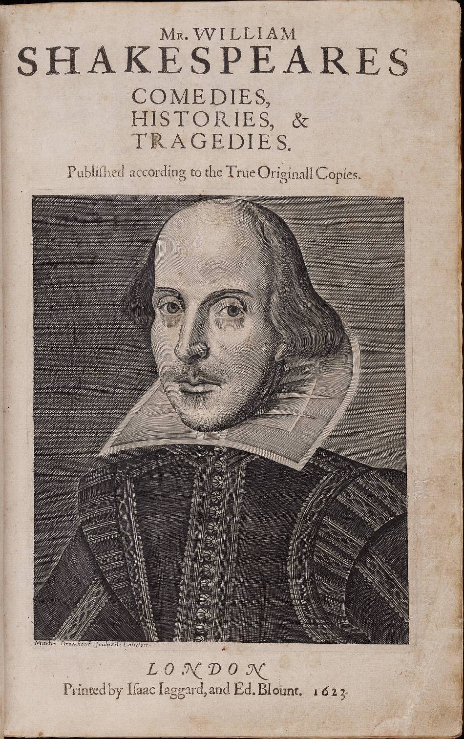
I am taking a Shakespeare course this winter, and have learned that the Great Bard himself occasionally misstated a few historical facts. But as the wise instructor of my class says, those small factual misstatements did not prevent Shakespeare from capturing the true reality of the human experience, in all of its glory. In other words, Shakespeare might not have gotten all of the "small t" truths right, but he definitely got the "Capital T" Truths right!


"Wheatfield with Cypresses"
Vincent van Gogh
I believe that all art involves the search for "Capital T Truths". When painting, I sometimes recall a quote attributed to Tolstoy: "Facts stand in the way of Truth". Put differently, the slavish painting of every telephone pole, every fence post, every leaf on every tree, does not

Monday, June 22, 2015

90% Perspiration

Self Portrait
Eugene Delacroix, 1837
We are all familiar with the old saying that the achievement of success is 10% inspiration and 90% perspiration. Part of the deal is showing up to work, every day, whether one is feeling particularly inspired or not. I am fond of another 90/10 expression, which goes something like this:

Wednesday, April 29, 2015

Flower Power

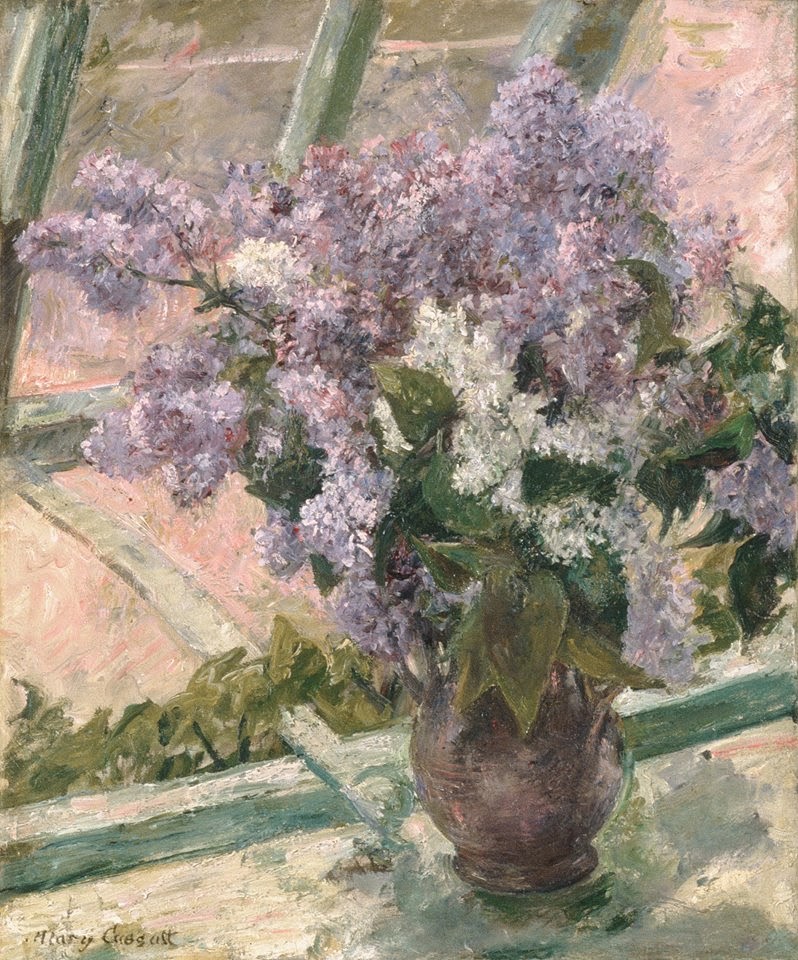
"Lilacs in a Window"
Mary Cassatt, 1879
Up now at the Virginia Museum of Fine Arts in Richmond: "Van Gogh, Manet,and Matisse: The Art of the Flower". I recently saw the exhibit, and was impressed with its breadth. There were masterworks from museums such as the Louvre and the Musee d'Orsay in Paris and the Van Gogh Museum in Amsterdam. It's definitely worth a detour to catch this one. One might ask, "How many pictures of flowers can a person look at in one show??". No problem for me--the subject matter is not so important, because

Tuesday, March 24, 2015

Now You See It...

Photo courtesy of BrainDen

Part of being a perceptual painter is studying human visual perception. Sometimes it seems that you have to be a physicist to understand how all of this stuff works. But even without understanding the "why", you cannot refute the fact that the same color looks quite different depending on what surrounds it. For example, both dogs you see above are exactly the same color. They just APPEAR to be different colors because of the colors that surround them. And then we have the classic checkers illustration below:


Squares A and B are exactly the same shade of gray. (I could say something here about 50 shades, but I won't). This is Adelson's well-known "shadow illusion". It is because of this principle that the painter Kevin Macpherson told us in his workshop that "Black in light is lighter than white in shadow". It's a tongue-twister, and sometimes a mind-twister too. Here's another example: planes A and B below are exactly the same color. No kidding. Test it out by putting your finger over the joint where they meet.


We painters need to understand these concepts so that we can make believable paintings from pigments that come out of tubes. Nothing that comes out of a tube can be as bright as the sunlight, or as dark as the ocean depths. So we painters have to create an illusion by juggling the COLOR RELATIONSHIPS. Eugene Delacroix certainly understood this when he said "I can paint you the skin of Venus with mud, provided you let me surround it as I will."

Delacroix knew that the same color looks quite different depending on what is next to it. Along those lines, the scientist Eugene Chevreul formulated the Law of Simultaneous Contrast. He noted that a color looks brighter and more intense when it is placed next to its complement. See how the orangy-red looks so much brighter when surrounded by its complement, blue:


It's really a bonanza for a painter to understand this concept and be able to apply it at the easel. I found out last summer that there is no way to make a lavender field seem as bright as it really is without bringing some dark green right up to it.


"Lavender Below Bonnieux"
8 x 12, oil on linen
(c) Lesley Powell 2014

Similarly, when I am having a hard time making terra cotta bricks look bright enough without washing them out, there is no better approach than introducing some blue into the surroundings. 


"Along the Lynx Line"
12 x 14, oil on canvas
(c) Lesley Powell 2014

It all goes to show--an artist must be a master of perception---and of deception!

Tuesday, August 26, 2014

Sacrificing Detail


"Distant View, Rainy Day"
4.5 x 9.25, oil on linen
(c) Lesley Powell 2014
I have recently been trying to approach my landscape paintings with an eye toward simplification. I am working to omit needless details, and focus instead on the essence of the subject. So of course my heart leapt up recently

Thursday, December 5, 2013

Reproductions: A New High, or a New Low?


A friend recently alerted me to a new phenomenon, something that takes the "art" of reproduction to a new level.  The Van Gogh Museum in Amsterdam is releasing certified reproductions of five Van Gogh masterpieces. Each sells for the amazing price of only $35,000. (Yes, you did count three zeroes).


An 1890 painting by Vincent Van Gogh entitled "Almond Blossoms." Even if you have $100 million or so to spend on a famous painting, the original masterpieces of Vincent Van Gogh are not for sale. But for $35,000 you can purchase a three-dimensional reproduction.
"Almond Blossoms"
(c) Vincent van Gogh

The reproductions are made using technology from Fujifilm called "Reliefography". It is an advanced form of inkjet printing that claims to reproduce the exact surface texture and brush strokes of the original, in a 3D print. Curators claim 95% accuracy. Hmmm.

Is this a nail in the coffin for those of us who create original, hand-made, one-of-a-kind paintings? Will people actually pay five figures for an inkjet print? It seems that modern technology can knock off almost anything a person can create--but can technology itself CREATE? 

As for me, I believe that there is no substitute for human creativity. I agree with the great French painter Eugene Delacroix, that the gift of the artist is to show the world new things about old subjects--things that others have never before appreciated. Delacroix wrote in his wonderful Journal (May 1824): "Nature has stored away for great minds...more new things to say about her Creations...than she has created."  Amen.