Showing posts with label blues. Show all posts

Sunday, February 16, 2020

Blue & White Forever!


"Anemones and Chinese Vase"
Oil on canvas, 23 5/8 x 36 1/4
Henri Matisse, 1922
Among the small handful of things that I would count as truly timeless, one rises to the top: blue and white porcelain. The Chinese invented porcelain as long ago as the 700's, but they managed to keep the formula secret for over a thousand years. Europeans probably saw their first porcelain when Marco Polo brought some back to Venice after visiting Kublai Kahn. And the fascination began! Blue and white porcelain has always had a hint of the exotic, and has been widely sought after. No wonder that artists have portrayed it in their still life paintings ever since the Renaissance.

"Still Life with Chinese Porcelain Jar"
Willem Kalf, 1669
I love to look at paintings of blue and white porcelain, and consider the vastly different approaches to painting it. From the finely detailed works of Dutch masters, to more whimsical depictions by Matisse and other moderns, there much to delight the eye. And of course the scholarship on blue and white porcelain is limitless. I have read that the vase depicted by Matisse in the top image is "underglaze blue with figures in a landscape, possibly of the Kanji period" (that's 1622-1722).*  How it can be identified so precisely is something of a mystery to me. But it's nice to look at, and it's the first place my eye goes in this painting.

"Lady at the Tea Table"
Oil on Canvas, 29 x 24
Mary Cassatt, 1883-85
Sometimes porcelain is the main player in these paintings, and other times it is a supporting actor. Just above is an example of blue and white as a strong supporting actor: a portrait by Mary Cassatt, depicting her cousin serving tea. The tea set is of Nanking Ware, probably from the late 1700's. They say that it was probably a cherished family heirloom. Very appropriate for inclusion in a family portrait, wouldn't you say?

"Still Life with Melon"
Oil on Canvas, 20 7/8 x 28 3/4
Claude Monet, 1872
Nowadays blue and white wares are widely reproduced. Some reproductions look cheap, but others can be very convincing. I have both types in my studio to use as props. And one or two true antique pieces. There's no substitute for the real thing! The coloration of the antique pieces is truly inimitable--and fun to paint. 

"Chinese Pots"
Oil on Canvas, 11 x 14
(c) Erin Gafill

I'm closing with paintings by some of my favorite contemporary still life painters, and one of my own. Enjoy!
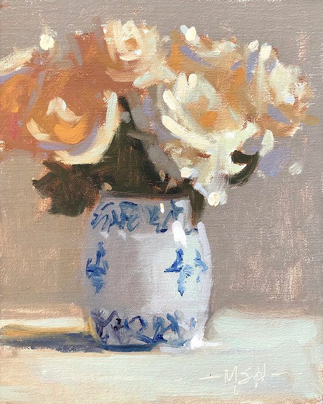

"Silvery Light"
Oil on Linen Board, 10 x 8
(c) Marjorie Hicks

"Orchids, In Full Swing"
Oil on Board, 24 x 18
(c) Lesley Powell, 2019
Available at Huff Harrington Fine Art


*Identification of particular porcelain depicted in paintings is from Blue & White China Origins and Western Influences, ed. John Esten, c. 1987.

Sunday, September 14, 2014

Hue Knew?? Cerulean Blue

Cerulean Blue
Some time ago, I wrote about the various blue pigments. One of them is cerulean blue. (Trivia point: Movie buffs and fashionistas may remember Meryl Streep holding forth about cerulean blue in the movie "The Devil Wears Prada"). Cerulean is a light, bright blue pigment. It was first developed in the 1860's, and was an important part of the palette used by the Impressionists. Here is a favorite painting by Monet that uses plenty of cerulean:


Claude Monet
"Gare St. Lazare"
Chemically, cerulean is cobalt stannate. It is made by mixing cobaltous chloride with potassium stannate. As it turns out, true cerulean is a very weak color. And it is also quite expensive.

Enter "Cerulean Blue Hue". Many times, when you see the word "hue" on a tube of paint, it is an indication that the paint is of an inferior grade. Not so in this case. "Cerulean Blue Hue" is made from phthalo blue mixed with white. It is actually "stronger" than its namesake--which is to say that it has more tinting power. As as added benefit, it is also less expensive to make than the original cerulean blue. Hue knew?!

For the curious, phthalo blue is a "modern" pigment, first developed in the 1920's. It is VERY powerful...I have always found the phthalo colors too garish. Little did I know that phthalo blue is the basis of the Cerulean Blue Hue that I use every day! In fact, it played a prominent part in the painting below:

"Joucas from Below"
9 x 16, oil on linen
(c) Lesley Powell 2014
So, my exploration of cerulean blue taught me a few new things about the pigments on my palette. And I also discovered that the term "hue" on a paint label is not necessarily a bad sign! I am inspired to return to my series of studies on pigments, and see all the other nifty stuff I can learn...

Sunday, June 30, 2013

Got the Blues


"White Wicker"
12 x 12
Lesley Powell

It's been a while since I wrote about a particular hue, but my post on REDS was very popular, so I've decided it's time to take a look at some blues. I typically use two blues on my palette, a light blue and a dark blue. 

For my light blue, I use Cerulean. Cerulean is a bright, vibrant color. I have learned that a little bit of this paint goes a long way! It was first developed in the 1860's, and it became an important part of the Impressionists' high key palette. This famous painting by Monet  features cerulean in the sky:


"Gare St. Lazare"
Claude Monet
The name "cerulean" is derived from the Latin word caeruleus, which in turn is derived from the diminuitive for heaven or sky.  So I guess it is not surprising to learn that the Impressionists often used cerulean for painting skies. Here's a plein air painting I did in the south of France that features a bright cerulean sky:


"Bonnieux Lane"
11 x 8

My dark blue of choice is Ultramarine. The shadows in the painting above are based on ultramarine, so the painting is a good example to show the difference in the two hues. 

Hardly a newcomer like cerulean, ultramarine has been used in paints for over 1500 years. It was used in the ancient world for cave paintings, and in the Renaissance by artists such as Leonardo da Vinci and Michaelangelo. Ultramarine is made from crushed lapis lazuli, which is a semi-precious stone. Lapis lazuli was, and I believe still is, mined exclusively in Afghanistan. But thankfully, the pigment has also been made artificially, and more inexpensively, since the 19th century.


Back in the mid-1600's, Johannes Vermeer used pure ultramarine made from lapis lazuli. Take a look at the wonderful blues in his work below. Imagine how vivid the blues were before time darkened them! Just as an exercise in high/low comparisons, I'm showing my own little denim jacket below, which is largely in ultramarine. Not that I would ever dream to compare myself to Vermeer--but it's fun to see old world and new world examples!


"Woman in Blue Reading a Letter"
Johannes Vermeer


"Denim Jacket"
12 x 10
Lesley Powell