Sunday, October 23, 2022
Gouache On the Go
Wednesday, May 18, 2022
Paper, Explained
In response to my latest newsletter, I have had lots of questions about how to frame or display works on paper. There are more options than you might think. Mounting, matting, glass, no glass....read on!
First, about the paper. There are several brands of paper that are specially milled and treated to accept oil paints. The artist doesn't need to do anything extra to prepare these--they arrive ready to work on. Another option is to prepare your own paper support. I often use BFK Rives print-making paper. I prepare it with two coats of shellac, which keeps the oil from permeating the paper. It makes a wonderful, smooth surface. You can do the same thing with sturdy multi-media paper, or watercolor paper.
Now, to the finished painting. One option is to mat it. I leave a nice margin around the painting, so a mat can go on without covering any of the subject. You can cut the mat to a standard size, which enables you to buy a ready-made frame for it (thus saving money!).
Do you need to put glass over the matted painting? No. I can be framed sans glass. But you can use glass if you want to. Just be sure that the glass is not actually touching the painting. A mat is typically thick enough to keep the glass spaced off the painting. The image just above is a painting on paper by Erin Gafill that I bought and matted, then framed under glass.
Another option is to mount the painting on panel. The panel is first primed with an acrylic primer to prevent discoloration. I often mount paper on a flat panel (as immediately above), which allows for a number of frame options. I have recently mounted the paper on a cradled panel (shown below), so that it can be put in a floater frame. This makes for a really nice look.
Bottom line: Don't be afraid of paper! And feel free to contact me with any questions--I'll try to find the answers!
Sunday, October 10, 2021
Making my Own
For all you painters and art collectors, I want to share this information on how I make many of my own painting surfaces. I love to paint on Belgian linen, and I often paint in non-standard sizes. As a result, it is an important factor in my work to have custom supports. Here's how I do it:
I often paint the painting on "loose" linen, just clipped to a board. If the painting doesn't work out, I can wipe it down and start over. If the painting DOES work out, I then mount it on a wood or MDF support. (Incidentally, these woods are getting harder and harder to find in the post-COVID world). The top photo shows a finished painting on loose linen, and the panel my husband custom cut for it. (Not shown: I treat the board with a coat of primer such as GAC 100 before mounting).
Next I loosely place the painting on the panel, and move it around until it is centered. That is the trickiest part of the entire process. Once I'm happy with the placement, I mark the back of the linen to show that placement (Photo #2). Next I get out my trusty acid-free, archival adhesive. Usually I use YES paste (Photo #3).
I spread the YES Paste thinly on the panel and also on the back of the linen, using a flexible palette knife (photo #4). It's a lot like icing a cake. When that is done, I press the painting down onto the panel and smooth it out with my hands. Then I press it again using a rubber brayer, working from the center out to the edges, to make sure that any air bubbles are gone and that the linen is securely and evenly attached to the panel (Photo #5).
Finally, if I have been smart enough to leave a good margin of linen (like I did for this example), I wrap the linen around the panel (Photo #6). Wrapping it around gives a wonderful finished edge to the painting, and allows the painting be to displayed unframed and still look very "finished". It also allows the painting to be "floated" in a frame, without exposing any raw edges.
One last step not pictured here: I put the painting face down under a pile of heavy books overnight, to allow the paste to dry and the seal to bond. And the next morning, Voilà! An uber-custom painting, ready for its close up! It's a pretty involved process, but the result is well worth it to me. Enjoy!
Monday, July 19, 2021
Kick Start, Part II
My last post talked about the way that using new materials can kick start your creative process, or even open the door to a new way of working. I promised to explore that notion in more depth. So--this time I'm writing about oil painting on paper. Yes, plain ole PAPER.
You can buy special papers that are pre-treated for oil painting. These papers don't require any preparation--you just start painting. Eliminating the preparation time is a huge advantage, but I have found drawbacks to these papers. One of the popular brands is so absorbent that it practically sucks the paint off your brush and absorbs it deep into the paper. That's great when you are in a "lay it and leave it" mode, but not so great when you want to move paint around on the surface. Another brand is pressed to have lines that mimic the weave of canvas. Sometimes that's nice, but then again why not just use canvas if that's what you're after?
My latest exploration is painting on heavy drawing or print-making paper. Or even watercolor paper. I have learned in my research that if you give these surfaces two thin coats of shellac, they are archival for oil paint. The shellac creates a barrier that keeps the oil "sitting on top" of the paper. The surface is very smooth, but not TOO smooth. And if you paint a picture that is a keeper, you can mount it on board or another stiff surface, and (if done properly) the painting can be treated like any other oil painting.
I have really enjoyed working with this new surface. I love the way it accepts the paint. And the way you can scratch back into it to make expressive marks (like you see on the blueberry stems above). Plus there is a freedom in painting on paper--since paper is less expensive than the linen I usually use, there is not so much at stake. You can let go and experiment without wasting a lot of resources.
Another advantage if you know how to paint on paper is that you can shift gears in mid-process, and undertake a "change of state". That happens when a picture that begins as a drawing starts to feel more like it should be a painting. Putting a coat of shellac over the drawing allows you to take it to another state, and become an oil painting. Check out the photo immediately above for one of my drawings midway in this process. (I used an amber shellac on this one, but I usually use a clear one). I'm illustrating this post with other recent works on paper--enjoy!
Thursday, July 8, 2021
Kick Start
This is the week that, but for COVID, I would have been in a painting class in Provence with Maggie Siner. It's been an annual tradition for me most years over the past decade, and I've come to rely on it as a re-boot and source of inspiration for ongoing work. This year I am having to reach deep within to find my own kick start.
Merriam Webster defines the term "kick start" as a way "to give new energy to [something]". New energy is definitely a prerequisite to a satisfying painting practice. A serious painter is always seeking new challenges, new ways of seeing, and new ways of creating. That may involve using new materials, or using old materials in new ways.
As for me, I have been working with some new materials. For one thing, I have been exploring the world of drawing more deeply than in the past. I have drawn with charcoal, with marker, with pencil, with conté. Each of these has a different touch, and makes a different mark. And I have drawn on different surfaces, ranging from "laid" paper (which has a ridged surface) to smooth art paper to plain ole newsprint. The variation is enough to keep me alert and to keep me from falling into a rut.
Previously I tended to think of drawing as merely a preparatory step for painting. Now I am trying to think of drawing as an end unto itself. It's actually quite satisfying, and I find that I can explore new ideas more quickly than in paint. I'm illustrating this post with a few of my drawing efforts. Stay tuned for upcoming posts on other new materials being deployed in the studio...
Thursday, April 16, 2020
Choice Overload
I recently heard a talk on the subject of "Choice Overload". Choice overload is a cognitive situation in which people have a difficult time making decisions when they are confronted with lot of different options. The more options they are given, the harder it becomes to choose among them. It can happen when ordering from a menu at a restaurant, or in the wine aisle at the grocery store. I can certainly relate to this phenomenon from personal experience!
Unfortunately, a painter can't avoid choice overload altogether. The real panoply of choices arrives when you start trying to identify what you are seeing. Among the vast visual information that makes up the landscape, where is the darkest dark? the lightest light? the most intense color? Is that red awning leaning toward the blue, or the yellow?
And there are even more choices to be made when mixing colors from the paints that come out of the tubes. For me, there is no fixed formula. Instead, there are many different ways to arrive at the same color. Hmmmm: perhaps a subject for a future post...
Monday, April 6, 2020
From Pollution to Paint
Thursday, November 14, 2019
Paris on Cartón
![]() |
| "Child Playing" 43.8 x 57.8 cm, Oil on Cardboard Édouard Vuillard |
Cartón was an especially appropriate choice for Paris, because it speaks of a past era of Parisian paintings. Who can think of Édouard Vuillard without remembering his wonderful use of that brown cardboard? I am always intrigued by the way parts of the cardboard are left showing through in the finished painting. It unifies the painting, and I think it helps show the hand of the artist, because we see what was left un-painted.
![]() |
| "Woman Curling her Hair" Oil on Cartón, 56 x 39 cm Henri Toulouse-Lautrec, 1876-1900 |
![]() |
| "Woman with Black Boa" Oil on Cartón, 53 x 41 cm Henri Toulouse-Lautrec, 1892 |
![]() |
| "View from Pont Sully" Oil on Cartón, 10.5 x 7.5 inches (c) Lesley Powell 2019 (SOLD) |
Thursday, December 20, 2018
Christmas Cometh!
Wednesday, September 12, 2018
Undertones
![]() |
| Photo from Bill Guffey |
Sunday, May 6, 2018
Gouache
![]() |
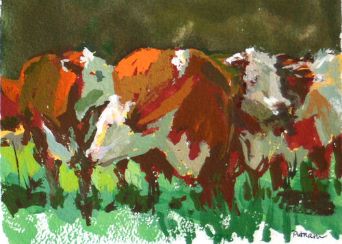
| "Friends in Tall Grasses" Gouache, 5 x 7 (c) Lori Putnam |
Not too many years ago, I had never heard of gouache, much less known how to paint with it, or even how to pronounce it. (Hint: rhymes with "squash"). But lately I have been experimenting with gouache--a new medium for me.
![]() |
| Gouache on Illustration Board (c) Mike Hernandez |
![]() |
| "The Scarlet Sunset" Gouache and Watercolor on Paper J. M. W. Turner, c. 1830-1840 |
![]() |
| Gouache on Illustration Board (c) Mike Hernandez |