Monday, December 30, 2013

Year End Report


As we reach the end of the calendar year, I thought I would give a status report on my paint consumption. You may recall that I made a resolution to fill a big glass jar with empty paint tubes by September 2013. I wrote about the resolution in "Paint like a Millionaire". The resolution was part of my plan to push myself to apply more paint to the canvas, for a more juicy, lush surface. Well, I didn't make the original goal, and I have to confess that the jar is still not full. But as you can see above, it's getting closer!

I have a few nearly empty tubes that are just itching to get into the "empties" jar. But as everybody knows from the behavior of the toothpaste tube---just when you think there is not another iota left, you find that you can squeeze out a tiny bit more!  These "keys" are one way to help you get the very last bits of paint out of the tube:


Thanks to the invention of the metal paint tube, oil paints can last almost indefinitely. And I hate to let anything go to waste, so I hold out until the very last gasp. Here is another handy device that literally puts the tube through the wringer:


Even with squeezing and wringing, all things must eventually come to an end, so stay tuned for future postings on my march toward the goal of filling the jar with empties...

Monday, December 23, 2013

Merry Christmas!

"Late for Evensong"
Oil on Board, (c) Lesley Powell
(Private Collection)

This is a painting I did some years ago, and I have been thinking of it as Christmas has been drawing near. The choir boys in the painting remind me of my grandmother's Christmas candles that were made like red and white robed carolers. Their open mouths were shaped like little "O"s, and their faces looked so angelic. Add to that memory the melodies of the Christmas carols that we proclaim this season, and I guess it's no wonder that this painting reminds me of Christmas.

May the peace and joy of Christmas fill your hearts and homes this season, and all the New Year ! 

Sunday, December 15, 2013

The Limited Palette


Ever since I began to paint, I have used a limited palette. That means that I use only a few primary colors, plus white, to mix all of the other colors in my paintings. Despite what the name might suggest, it is actually not limiting at all. On the contrary, it is very liberating to know that you can mix almost any color from the six or so tubes of paint you carry.  And it certainly lightens the load when you go out on location.

Kathleen Dunphy has written a great post on the advantages of the limited palette. Like many artists, she started using a large number of tube paints, but ultimately found her way to the limited palette. Thankfully, I never had to wean myself from a big Crayola box of paint tubes!

The accomplished Lori Putnam uses only three colors plus white. Someday I may be bold enough to try this. You can read Lori's "how and why" of her limited palette here. Here is a photo illustrating how Lori sets up her palette:


Look how much simpler and more organized this is than the photo at the top of the post! 

What's on my palette? A light and a dark of each primary color. I have written previously about my primaries. For yellows, Cadmium Yellow Light (light) and Raw Umber (dark). For reds, Cadmium Red Light (light) and Alizarin Crimson (dark). For blues, Cerulean Blue (light) and Ultramarine Blue (dark). I also use Burnt Sienna, and occasionally (as a "convenience color") Yellow Ochre. I'm a true believer in the power of the limited palette!

Tuesday, December 10, 2013

Meanwhile, Back at the Studio...


Blog followers may remember this post from Paris, about a painting session on a very gray day. I was determined not to let the weather keep me from painting the cityscape of one of the most beautiful cities in the world. In fact, the gray weather is a hallmark of Paris, so I felt like I was seeing the city in its natural light. I was painting the Pont des Arts, the wonderful pedestrian bridge that crosses the Seine. (This is the bridge that has become the repository of millions of "lovers' locks", padlocks that seal the couples' love.)

I am often asked about my painting process, and whether I work on my plain air paintings once I am back home in my studio. The answer is sometimes yes, sometimes no. Here's an example of a painting that I put a few tiny touches on after returning home. The painting started out as you see below, a mere silhouette of the skyline, with the bridge in front of it.


At the conclusion of my plein air session, the painting stood as you see it in the top photo. I was pleased with the looseness of the painting, and the way it captured the subtle shifts in grays...one gray for the sky, a greener gray for the waters of the Seine. But I had been unable to catch a few fine points while I was on site...I thought the painting would benefit from a cleaner definition of the rail of the bridge, as well as from some indications of the people walking across the bridge. I also cleaned up a few spots in the sky where my brush had gotten dirty on site, and left the area a bit muddy. Here is the final result.

"Pont des Arts"
7 x 14   Oil on Canvas
(c) Lesley Powell 2013

Stay tuned for a future post about a painting that I didn't touch one iota after coming in from the field...

Thursday, December 5, 2013

Reproductions: A New High, or a New Low?


A friend recently alerted me to a new phenomenon, something that takes the "art" of reproduction to a new level.  The Van Gogh Museum in Amsterdam is releasing certified reproductions of five Van Gogh masterpieces. Each sells for the amazing price of only $35,000. (Yes, you did count three zeroes).


An 1890 painting by Vincent Van Gogh entitled "Almond Blossoms." Even if you have $100 million or so to spend on a famous painting, the original masterpieces of Vincent Van Gogh are not for sale. But for $35,000 you can purchase a three-dimensional reproduction.
"Almond Blossoms"
(c) Vincent van Gogh

The reproductions are made using technology from Fujifilm called "Reliefography". It is an advanced form of inkjet printing that claims to reproduce the exact surface texture and brush strokes of the original, in a 3D print. Curators claim 95% accuracy. Hmmm.

Is this a nail in the coffin for those of us who create original, hand-made, one-of-a-kind paintings? Will people actually pay five figures for an inkjet print? It seems that modern technology can knock off almost anything a person can create--but can technology itself CREATE? 

As for me, I believe that there is no substitute for human creativity. I agree with the great French painter Eugene Delacroix, that the gift of the artist is to show the world new things about old subjects--things that others have never before appreciated. Delacroix wrote in his wonderful Journal (May 1824): "Nature has stored away for great minds...more new things to say about her Creations...than she has created."  Amen.


Sunday, December 1, 2013

Cypress Trees


"Five Sisters", (c) Lesley Powell 2013
30 x 40, Oil on Canvas
Available
While in the south of France this past summer, I became fascinated with the cypress trees. I was taken by their shapes...tall, narrow, reaching upward. I have heard the shape called "flame-like", and that seems very apt. In the strong winds, the trees bend, lean and sway, acting much like flames flickering on a candle.

Vincent van Gogh wrote to his brother Theo that the cypress trees "have such beautiful lines and proportions, like an Egyptian obelisk." Well, I have a weakness for the classical shapes of the ancient world, such as the obelisk and the urn, so that might help to explain my fascination with the cypress.

"Cypress and Vineyards" (c) Lesley Powell 2013
30 x 24, oil on canvas
Available 
Van Gogh also wrote about the difficulty of getting the dark color of the cypress correct. He called it "one of the most interesting shades of black, and the most difficult to get right, that I can possibly imagine." I heartily concur! I found it hard to make the cypress as dark as it actually is...a dramatic dark in an otherwise very bright, sunny landscape.

I tried to capture the majesty of the cypresses in the two paintings shown above. You can read more about the "Five Sisters" here, or the "Cypress and Vineyards" here.

Tuesday, November 26, 2013

Curious Yellow

"Blue & Yellow"
6 x 8, (c) Lesley Powell 2013

I have written previously about the history of various pigments, including reds and blues. For the curious, it's  now time to turn to Yellows. Yellow reflects more light than any other color, which means that it is at its purest and most intense at a very high value.  No wonder it is so bright and feels so cheery. 


As I wrote with  respect to blues, I typically use one light yellow and one dark yellow on my palette. My light yellow of choice is Cadmium Yellow Light. As you can guess from the name, this pigment contains the mineral cadmium. About half the cadmium produced today is used in batteries. A small percentage goes into pigments such as these paints. Cadmium is toxic. Some years ago, Senator Daniel Moynihan introduced a bill to make cadmium pigments illegal, but it didn't pass (sigh of relief from many artists).

Cadmium pigments were first made in the 1820's, and became more widely available for artists' use in the mid 1840's. They were part of the revolution that changed the palette and helped give birth to Impressionism. In fact, Monet used Cadmium Yellow extensively. There is a wide range of cadmium yellows, but I prefer the light.


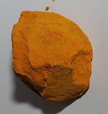
Indian Yellow "purree"

I don't use Indian Yellow, but while we are on yellows, the story is too good not to tell. It is widely believed that Indian Yellow was originally made in rural India, from cow's urine. The cows were force fed almost exclusively on mango leaves, then their urine was collected and dried, yielding hard yellow balls of the raw pigment, called "purree". (Photo above). The resulting color was a warm, transparent glazing yellow. The old practice was eventually outlawed because of the cruelty to the animals. Winsor & Newton introduced an effective, artificially manufactured Indian Yellow in 1996. Aren't we glad we live in the modern age??


My "dark yellow" of choice is Raw Umber...stay tuned for a future post, because the umbers are worthy of a column all their own.


Thursday, November 21, 2013

Holiday Open House

"Sargent Gallery"
16 x 16, Oil on Canvas
 
Please join me and 25 other artists in the Dilworth Artisan Station building as we open our studios to ring in the holidays! Our annual Holiday Open House and Sale will be held on Friday, December 6, 2013, from 6 pm to 9 pm.  It promises to be a festive evening. You will be amazed at the different points of view represented---from classical portraits to modern abstract works, and everything in between. Come see the latest work, and bring your friends! Here's a link to the official invitation, with links to websites of the participating artists.
 
We are located at 118 E. Kingston Avenue, in Charlotte's South End. My studio is on the top floor---3rd floor--#35. Here's a map. Clue: Office Depot is on the corner of Kingston and South Boulevard.
 
Hope to see you on the 6th!


Sunday, November 17, 2013

Polytych


"Chateau de Bourgane", ensemble 18 x 74
You may recall my earlier post about "Chateau Love". I was so drawn to this crumbly old chateau in Provence that I decided to undertake a bold effort to present it in a polyptych. Or maybe it's a double diptych. I'm frankly not sure exactly what to call it!


This was a real design challenge. I wanted each panel to be able to stand on its own. I also wanted any two adjacent panels to pair up well as a diptych. And any three adjacent panels to work as a triptych. After much sketching and head-scratching, I think I developed a layout that is successful.


The height of each panel is 18 inches, and the panels vary in width from 14 inches to 24 inches. I wanted to have the end panels the same size (for harmony) and the other panels different sizes (for syncopation).


These paintings are available for sale either collectively or individually--as single paintings, as a diptych, as a triptych, or as a quadriptych or in any combination of the above. Let your imagination run wild! You can read more about the paintings on my website here.


Tuesday, November 12, 2013

Special Preview: SMALL GEMS

"Olive Shadows"
8 x 6, Oil on Linen
As a special reward to my faithful blog followers, I am giving you this sneak preview of my 2013 Small Gems sale. Every year I select some of my favorite small works (such as the one above), price them especially for holiday giving, and donate half the proceeds to a charity. This year the donation will go to Levine Children's Hospital, in Charlotte, NC. The contribution will help launch an arts program at the hospital---bringing the power of art to young people who are facing serious illnesses.


Here is a link to the Small Gems collection on my website. I will officially announce the sale later this week.  This post is just a little head start for you, as a way of saying thank you for reading my blog.

While you browse the Gems, remember all the great ways you can use small paintings. Prop them in a bookshelf or on a kitchen counter, incorporate them into a grouping, or put them on easels as tabletop accessories. I especially love to see a little painting hanging low over a table or chest (as in the first photo below). Take a look at these shots for some inspiration! Please see the sale details in italics below.

Photo credit: House Beautiful

Photo Credit: Phoebe Howard


Photo credit: Things that Inspire
Photo Credit: Cote de Texas

Photo credit: Phoebe Howard

DETAILS: Each purchase is "Satisfaction Guaranteed"--if it doesn't work when you see it in person, you can return it within 10 days, no problem. Purchasers outside of NC--no sales tax, but you pay actual UPS shipping. Check preferred, but credit card possible. I will deliver to you upon receipt of your check, and hold the check until you are satisfied. Most (but not all) of the paintings are offered either framed, or unframed, your choice. Sizes and prices are listed on my website in the description of each painting.  A red dot indicates that a painting is SOLD


Friday, November 8, 2013

Framed

"Pont Julien"
7.25 x 14.75, Oil on Linen
'Tis a source of great vexation for me---selecting just the right frame for each of my "babies". Recently I have found a treatment that seems to work beautifully on my smaller pieces. It is a gold frame, in a soft tone, with a small wooden fillet. The fillet is antiqued a soft linen color. It provides just enough cushion between the frame and the edge of the painting that the painting doesn't seem squished. Room to breathe, so to speak. Many thanks to Veronica at Campania Fine Moulding for coming up with this!

Frame preferences vary so widely from person to person. I am always curious for feedback. Readers, what is your favorite framing approach?

Tuesday, November 5, 2013

Showcase Invitation

"La Source Cafe"
Oil on Canvas, 12 x 12
"Pont Julien"
Oil on Linen, 7.25 x 15

Just a note for those of you in Charlotte, to let you know that I am participating in the "Sustainer Showcase", sponsored by The Junior League of Charlotte. It's a one day event, to be held Tuesday, November 12. I will be offering a selection of small paintings (including the ones above, fresh off the easel!), as well as some works on paper. Details below. Part of the proceeds will go to A Child's Place, helping homeless children. The Showcase will feature a wide array of enticing items. It promises to be a great way to start your holiday shopping, and help a worthy cause at the same time. Hope you can drop by!


Saturday, November 2, 2013

Anatomy of a Painting

"Olive Trees"
16 x 20, Oil on Canvas
I thought it might be interesting to other painters, and perhaps even more interesting to non-painters, to see the progress of this painting from start to finish. The top photo is my finished painting, which measures 16 x 20 inches. It was painted largely en plein air, in an olive grove in the Luberon area of Provence.

This is the scene I chose to paint (ignore the follow painters under the trees!):


Here is my initial sketch on the canvas. I had previously toned the canvas with a neutral, medium value color. In my sketch, I was interested in the tree shapes and the shadow shapes, and trying to capture how lyrical they were:


Net step, putting in some foreground color, and getting a fix on the shadow shapes before they changed too much as the sun moved. Loved the bright sunlight color--this was getting fun! This is what you always hope for when starting a painting--a little thrill of excitement, when you put the paint on the canvas and say "Yes!".


Now on to stokes of color for the olive foliage, and adding some sky color, as you see below:


Here the hard work begins. I needed to create shapes for the undersides of the olive trees--hard to see, because the branches are so sparsely leaved. Maggie helped me see this better by smudging some of my darker strokes of color to create solid forms for the under-planes of the trees.


OK, now it's been almost four hours, and the time in the field is up. Below you see my painting at the end of the plein air session. You can tell by comparing it to the final version that I made some corrections on the shadow shapes, and opened up the shadow shapes a bit more,  once I got home to my studio. It's hard to resist tinkering with a painting, but I made myself let this one be, and am pleased with the result. Now I want to go back to the olive grove to explore the motif even further!


PS: To see more photos from the session in the olive grove, including the work of my fellow painters,  click here.


Tuesday, October 29, 2013

Van Gogh "Repetitions"


"The Postman Joseph Roulin"
Vincent van Gogh, 1889
"The Postman Joseph Roulin"
VIncent van Gogh, 1889
Vincent van Gogh seems to have been a recurring theme in my thoughts over the past few months. Ipreviously posted about several "breaking news" items concerning Van Gogh, including the exhibit at the Phillips Collection in Washington, DC. Here is link to a review of the exhibit from Fine Art Connoisseur, which I wanted to share with you.

The exhibit is focused on Van Gogh's "Repeitions"--scenes that he painted multiple times, each time with subtle variations. I love the idea of studying these repetitions, and I always wonder what makes us revisit the same subject over and over. Is it a desire to explore the subject more deeply? A wish to make a better painting of it than the time before? The realization that the subject is entirely different in a different season, a different light, or different time of day?

I like to paint in series, and yet I often like my very first painting of the series better than the ones that follow. Perhaps it is something about the freshness of the discovery that makes the first painting sing. The excitement of discovery can be an elusive quality for me to recapture in subsequent paintings of the same subject. That's why I like to vary the composition or point of view.

I appreciated what the review said about this. It noted that the degree of spontaneity helped the curators identify which were the first paintings in the series, and which were the repetitions: "The spontaneity found in the [first] painting pointed to its being the first rendition, while the more controlled execution in the Phillip's street scene designates it as the repetition." I hope to visit the exhibition and see for myself.

Sunday, October 27, 2013

Abstraction

"Villars from Afar"
8 x 13

One of the painters whose blog I follow is Colin Page. Colin recently posted a painting of an old bicycle, and wrote about how he created some abstraction within a representational painting. It was a wonderful post, and he explained so clearly his thought process and decisions about what to "abstract".
 
One technique Colin wrote about was "lost edges". I have previously posted about this approach in  "Not Too Edgy". The play of lost and found edges makes a painting interesting, and it involves the viewer much more than a perfectly delineated painting. I tried to use lost edges in the village scene shown above. Rather than drawing each roof, I simply chose one color shape for a part of the village, and then broke the lines up with the green of the trees.

Colin also described his use of calligraphic brush strokes in the foreground of his painting. He was looking for an opportunity to use some lyrical lines, and found it in the grasses. That is the same thing I was doing with the foreground of the painting above. There was a large stretch of vineyard in the immediate foreground, and I simply wanted to suggest it by means of bright green brushstrokes, and a few dark strokes for the shadows between the vines. I liked the overall effect, and have posted the painting as the cover photo from my website.

Friday, October 25, 2013

Seeing Light

"On High", 24 x 30
Available at Huff Harrington Fine Art
I recently posted on Impressionism and its emphasis on painting light, in a piece called "What's in the Tube". After posting, I thought about a couple of my own paintings that were illustrations of this approach--capturing the fleeting effects of light.

The top painting is a large one, done in my studio from a plein air study. The warm colors, the hint of sunset in the sky, and the sandy, rocky ground tell you about a moment in time, and a place in time. It is just before sunset, above a perched village in the Luberon (in the south of France).

In contrast, the painting below shows the same subject, and was painted the same day as the first painting, but the light had changed completely. The sun had disappeared behind the clouds and everything was gray. One viewer said "Just because it's cloudy doesn't mean it has to look like the Addams Family lives there!". Point taken. But--I was painting what I saw. (Sorry for the odd angle of this photo).

"On High, Cloudy"
Just to complete the cycle, here is a final painting of the same subject, painted in the middle of the afternoon with the sun out. As you can see, with this Impressionist approach the same scene can be an infinite number of paintings, depending on the time of day, the time of year, and the weather. Stay tuned for more examples!

"On High, Sunny Afternoon"
5.5 x 10.5, Oil on Canvas

Wednesday, October 23, 2013

Who Needs Clothes?


Time to head home from Paris. This is my suitcase at the beginning of packing. As you can see, the easel goes in first! On top of this go a big shipping tube with rolled canvas in it, then my paints, brushes and smaller apparatus. With little room to spare, I have learned to pack very lightly when it comes to clothing. I could probably get by with one small carry on for a trip around the world--if it weren't for the easel and paints!

For some serious advice about traveling with paints, Lori Putnam has a great post on the Oil Painters of America blog. Good basic info, and some nifty tips. Bon Voyage!

Monday, October 21, 2013

Drawing at the Musee d'Orsay


My friend Marie and I had another drawing session last week--this time at the Musee d'Orsay. Unbeknownst to me, Marie snapped this photo. It shows me working on a "blind contour" of the sculpture. I was inspired to work on blind contours by reading "The Natural Way to Draw", by Kimon NicolaidesIn a blind contour, you look only at the subject, and you move your pencil along with your eye, as your eye travels the contours of the subject. No looking down at the paper!

The idea of working on blind contours is to let your pencil point "become" your eye. It is also intended to help involve your sense of touch in your drawing. As your eye travels the contours of the subject, you imagine touching those contours, and you try to be guided more by the sense of touch than by sight.

Let's just say that I can get some very "interesting" results...and not the sort that one wants to publish on one's blog! But I take heart--as Nicolaides says, "Don't worry if your studies do not look like anything else called a drawing that you have ever seen. You should not care what your work looks like as long as you spend your time trying." It's all a process...

Friday, October 18, 2013

Cafes of Paris

"La Source" cafe, Paris
(c) Lesley Powell 2013
Ever since arriving in Paris, I have been suffering "cafe envy". I walk by and hear the clatter of the dishware, the chatter of voices, the smells of coffee and coissants--and I long to be sitting right there myself with friends. My favorite cafes are located on corners, with generous awnings wrapping around the intersection.

This cafe, La Source, is one I walk past every day. I checked out the light conditions at various times of day, and decided it was a morning motif. When we finally got a sunny morning, I rushed out to try to capture the scene. Here I am loaded with my gear on the way out the door:


This was a moment when I could really appreciate the benefit of painting en plein air. I could see the sweep of the sun as it washed the side of the building. The shadows were so cool. The dappled light on the red awning so fast-changing. I could never have gotten this from a photo! I even found a spot to stand that did not interfere with pedestrian traffic or draw attention from passers-by.


Stay tuned for the "reveal" of the final painting...