Sunday, December 31, 2017

A New Leaf


Happy New Year! I could not resist the title of this post, since the New Year is the time we all make resolutions, and vow to turn over a new leaf in certain areas. But the "new leaf" I am writing about is a quite literal one: I've been painting a new plant lately, and one whose leaves are most compelling.

I waited eagerly all fall for the cyclamen to arrive in garden shops. The cyclamen is a cold weather plant, so the plants don't come in until after that first cold snap. They often show up after Thanksgiving, and they are beautiful for Christmas decor. The white ones are my favorites, because I love to paint white things. They always show us that "white" is not actually white. In fact, white can be almost any color, depending on the light and the surrounding objects.

Detail from a recent painting (c) Lesley Powell 2017

I love the cyclamen flowers--some writers have described them as looking like shooting stars. I find that, although they all have an "upswept" look in common, they often take different shapes. Some of them remind me of badminton shuttlecocks.  Others remind me of the Flying Nun (that shows my age--Sally Field fans unite!). Still others look like a windswept figurehead on a ship. (That's how I saw the one of the left, just above). No matter their particular configuration, the flowers are elegant and sculptural. Not unlike the orchids I love to paint.

"Cyclamen II"
12 x 9, Oil on Canvas
(c) Lesley Powell 2017

The cyclamen leaves are also a noteworthy feature of the plant--and very intimidating to paint. Gardener's Supply says that the leaves are "embroidered with intricate, silver patterns." And there are certainly lots of them! I challenged myself to simplify both the leaves and the flowers of the cyclamen. I kept in mind the words of that great painter of flowers, Georgia O'Keefe. O'Keefe said: "Nothing is less real than realism...details are confusing...it is only be selection, by elimination, by emphasis that we get at the real meaning of things."


This one's still on the easel...
Well, I would not compare myself to Georgia O'Keefe, but I do share her philosophy of simplification.  You can let me know how well I did in avoiding confusing details and capturing the real personality of the cyclamen. Check out the images of the finished paintings here. Thanks for looking!


Tuesday, December 19, 2017

A Christmas Card


"Snowbound"
John Henry Twachtman, 1895


Merry Christmas!

My Christmas card to you faithful readers: "I'm Dreaming of a White Christmas"--and this beautiful painting inspires me. Wishing you and all your loved ones the joy, love and peace of Christmas--now and throughout the New Year.

For some beautiful images pointing the way
to the Nativity,
check out my Nativity post here.


Tuesday, December 5, 2017

A Numbers Game


It's that time of the year again, when I clean out my studio for the Holiday Open House. This is without doubt the most thorough cleaning that my studio gets all year! The first step is to put away all of my scraps of fabric and still life props (see below). These things have a tendency to multiply--I rationalize that I never know when I might need a certain color, or certain size object, to complete a composition! The next (and hardest) step is to select a group of paintings to show at the event--and to store the rest of the paintings out of sight. The idea is to create a well-curated display, and to eliminate distracting clutter.


Because my storage space is limited, this is a good time to purge a few paintings that just never made the mark. Some of the paintngs are old ones, that I have held for years. They often have a small passage that I really love, which keeps me from throwing them away. I have harbored the hope that the rest of the canvas could be brought up to snuff. Alas, that hope is almost never fulfilled So out they go.

I am not alone in destroying old work. You can read about some creative approaches to destruction here. Sometimes when I look at the discarded canvases, I lament the wasted effort. I feel frustrated that I could not make the paintings "work". But I remind myself of the  very wise words that I read in the book Art & FearThe authors wrote, "The function of the overwhelming majority of your artwork is simply to teach you how to make the small fraction of your artwork that soars." They noted that even the failed paintings are essential. I might say that ESPECIALLY the failed paintings are essential. Why? Because in one's failures lie the lessons that lead to future successes. 


I think of this as another version of the 80/20 rule: Eighty percent of your work serves as a foundation for the other twenty percent that really soars. Or in the words of an esteemed painter friend, "Some days we produce; other days we learn." And so we carry on...


Saturday, November 25, 2017

Announcing Maggie Siner Master Class 2018


13 x 10, oil on linen
(c) Maggie Siner 2016
Exciting news--the calendar is set for Maggie Siner's painting workshop in France this summer! We will be painting in Provence from July 21 to July 28, 2018.  You can check out the details here


Farm with Black Hedge
11 x 17, Oil on Linen
(c) Maggie Siner 2016
We will be staying in the tiny hamlet of Les Bassacs, nestled in the heart of the Luberon. Far from the tourist crowds, we will explore sweeping countryside vistas, ancient perched villages, agricultural fields, and even Roman ruins. Maggie used to live in this area, and she has a native's grasp of the landscape. She has scouted out the painting locations that are

Tuesday, November 14, 2017

Value Judgments

Photo from Jennifer McChristian
Painting is all about making value judgments. And I don't mean the sort that concern good and evil!  In the world of art, "value" describes the relative lightness or darkness of things. Many fine artists believe that value is far more important than color in the success of a painting. I remember quite well what Peggi Kroll Roberts said to us in a workshop, "Color gets all the glory, but value does all the work." So true.


If you're not familiar with the concept of value, you can start by thinking of a black and white

Saturday, November 4, 2017

Zorn Retrospective

Zorn portraits at the Petit Palais
Photo (c) Lesley Powell 2017

At the risk of having too many posts this year about Anders Zorn, I am compelled to report on the Zorn retrospective now running at the Petit Palais in Paris. In my opinion, this show is unquestionably a WOW. As much as I have admired Zorn's work in books and online, I was not prepared for the impact of seeing them in person. The experience reminded me once again why it is worth the time and effort to visit museums: there is simply no substitute for seeing a work of art in person. Here are some of my takeaways:


Photo courtesy of the Petit Palais

(1) Fantastic job by the museum in staging the exhibit. The lighting, the display rooms, the label copy--everything added up to a wonderful experience. The exhibit was organized into a series of rooms, each of which was decorated to complement the nature of the paintings displayed in it. There were rustic, wooden rooms for the native Scandinavian paintings, and elegant, rich red rooms for the society portraits. There were life-sized photos of the Grand Canal in Venice. It almost made me feel like I was following Zorn in his travels around the world.


"A Portrait of the daughters of Ramon Subercasseaux"
32 x 25 1/2 inches, oil on canvas
Anders Zorn,  1892
(2) Astonishing composition and design by Zorn. Anders Zorn is well known for his bravado brushstrokes and wonderful color work (using a very limited palette, mind you). In viewing the body of work in the exhibit, I was also struck by the range of his compositions. So many of the compositions were startling in their originality and success. I found myself thinking "Who would have thought to design the painting this way, and who could have pulled it off so well??" Two different paintings, each of two young girls, exemplify this daring composition. They are shown just above and below this paragraph.


Les demoiselles Schwartz
37 3/4 x 26 inches, Gouache over black chalk on cardboard
Anders Zorn, 1889
(3) The etchings were as strong as the paintings. Interestingly, many of Zorn's etchings were derived from his paintings. I would have thought that the black and white prints were precursors to the paintings, but I would have been wrong. To quote James Ganz, "Zorn's brilliant handling of the etching needle enabled him to freely translate his colorful brushstrokes into pure chiaroscuro, an essentially binary language of line in which the visual drama is distilled into black and white." 


"The Toast"
Etching
Anders Zorn
"Mrs. Emma Zorn"
Etching
Anders Zorn, 1900

I love the slash-y strokes of Zorn's etching pen, and the way he divided his etchings into areas of light and dark. In the images above, you can see that Zorn often connected the dark areas of the print, and kept them on one side, leaving much of the remainder of the picture frame light or white. Gorgeous and powerful. If you are curious about the etching process, and Zorn's etchings in particular, click here for a great post by the Milwaukee Art Museum.

The retrospective in Paris will continue through December 17, 2017. If you can't make it across the Atlantic, there are several good UTube videos on the Facebook page of the Petit Palais, which you can reach by clicking here. And remember that the Isabella Stewart Gardner Museum in Boston has a very fine collection of Zorn's work, right here in the USA. Enjoy!


Sunday, October 29, 2017

Things that Go Bump in the Night

"Le Mauvais Pas"
Woodblock Print
Felix Vallotton, 2893

Halloween is just around the corner, and everywhere I look there are pumpkins, skeletons, ghosts and other indicia of the holiday. I started a bit of research about Halloween for this post, but quickly despaired, because of the vast number of theories about the real origins of Halloween. 

Many of the theories are conflicting. Let's just say that it's a centuries old tradition, which some say dates from the Celts over 2000 years ago. The Celts believed that on the night before November 1 (the start of their new year), the ghosts of the dead returned to earth. 


"Black Cat"
Watercolor
(c) Beverly Brown

Most would agree that the holiday we know today has roots that are both pagan and sacred.   Halloween falls on the night before All Saint's Day--a day recognized by the Roman Catholic Church in 609 A.D. to honor those who have died and gone to heaven. According to

Thursday, October 19, 2017

Driveritis


"Sloop Chapel"
12 x 8, Oil on Linen
(c) Lesley Powell 2017

Are you familiar with the ailment "driver-itis"? It's a very common affliction among plein air painters. It is characterized by an incessant driving around, looking for the perfect spot to paint. If you have a severe case of driver-itis, you might drive for hours, constantly thinking the the "right" spot is just around the corner. In the end, you don't get any painting done, and you spend the whole day in your car.

You may think this is funny, but it's true! I recently traveled to the North Carolina mountains to participate in a Paint Out to benefit The Crossnore School & Children's Home. Unlike some of the painters, I do not have a home in the mountains, and I am not very familiar with

Monday, October 9, 2017

Necessity is the Mother....

My Setup in the Luxembourg Gardens
We all know the saying that "Necessity is the mother of invention." I have always loved this saying. It's a testament to human imagination and to the things we can concoct when there's a pressing need. Do you remember Apollo 13? After the spaceship was crippled by an explosion, the NASA crew and astronauts figured out how to use a mish-mash of random  materials to hook up a carbon dioxide removal system. Amazing!

I would not dare compare my efforts to those of the astronauts. But I recently did some improvising of my own, which allowed me to paint on a trip to Paris. I had promised my husband that this trip would be VACATION--no painting! But after ten days of withdrawal

Friday, September 29, 2017

A New Friend

Studio of Jean-Jacques Henner
On a recent trip to Paris, I met a new "friend": Jean-Jacques Henner. Nevermind that Henner died over a hundred years ago--I felt as if I had actually made his acquaintance simply by visiting his home and seeing his paintings. Like most painters, I have a real "thing" for seeing the studios of other artists. And the joy is even greater when the studio is in an historic home, once inhabited by the artist, now open to the public as a museum. Yum!


"La Liseuse"
Jean-Jacques Henner
Jean-Jacques Henner

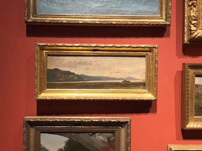
Henner was a French painter, born in the Alsace region. He was a master of sfumato--a blurring of the lines often practiced in the Renaissance. In English, "sfumato" means soft, vague, or blurred. The approach makes for a very soft transition between shapes and colors. Henner is well known for his softly rendered nudes. Even his still lifes have a sensuous softness of line. But the paintings that really spoke to me were his landscapes.

"La Baie de Naples, la peninsule Sorrentine et Capri"
Jean-Jacques Henner, 1862

"Vue de Bernwiller dans les arbres"
Jean-Jacques Henner, 1890-1905

Faithful readers know that I am always trying to simplify the complexities of the landscape. I believe that strong, simple shapes, and accurate color relationships, convey more than a myriad of details. Some of Henner's landscapes were absolute proof of this concept. The stunning little paintings just above practically took my breath away. How could he say so much with so little?!?  These paintings stand beautifully on their own, but look what happens when you put them in a frame. They become truly monumental!


Some of Henner's landscape paintings were no more than silhouettes. But they too captured my imagination. No mere cut-outs, these! They had grandeur, heft and dimensionality. I felt as if I could walk right into the scene and smell the air. Two of these paintings are featured below. The second painting, "Houses in the Fog" really struck a chord with me. I felt like I was looking out my own window. The image is iconic and universal.


"Paysage de la Dollee"
Jean-Jacques Henner, 1890-1905

"Maisons dans la brume"
Jean-Jacques Henner

If you are visiting Paris, and looking for a destination somewhat off the beaten tourist path, I can recommend a visit to the Henner Museum. It was just re-opened in 2016 after extensive renovations. Photos can never do justice to original works of art, and these are worth seeing in person.  Nearby is the Parc Monceau--definitly worth a stroll. You can make an afternoon of it. Enjoy!


Saturday, September 16, 2017

Edouard Vuillard, Revisited

While I am on holiday, I am re-posting a few favorites from years back. Enjoy!

"Lilacs"
Oil on cardboard, 14 x 11 1/8
Edouard Vuillard, 1892

Meet one of my favorite artists, Edouard Vuillard. I was first drawn to Vuillard's work because of his evocative paintings of interiors. As I learned more about him, I became fascinated by his early work as part of the "Nabis", a group

Wednesday, September 6, 2017

Multi Media Expert

"Maja von Heijne"
Etching, 1911
Anders Zorn


I am very excited about a major retrospective in Paris this fall, featuring one of my favorite artists, Anders Zorn. I have written about Zorn before, but I have not had the opportunity to see many of his works in person. I hope to remedy that soon: I already have my ticket to the retrospective!


"Une Premiere"
Gouache
Anders Zorn, 1888

One thing that fascinates me about master artists is that they seem to delight in many different media. Zorn was no exception to this phenomenon. He was a wonderful watercolorist, as well as a virtuoso painter. He was also known for his talent as a printmaker,

Tuesday, August 29, 2017

Behind the Scenes

Lesley in Provence

Lots of you are curious about the steps involved in painting abroad and getting those paintings back home to the States. Especially when one paints larger paintings, or lots of them: How do you get them all safely home, and ready to hang?


When I embark, I take my blank canvas (mostly Belgian linen) rolled up in a sturdy mailing tube. Having long rolls of canvas allows me to select any size for any particular subject. That provides much more flexibility than painting on pre-cut panels! I also take a piece of plywood, as large as will fit in my suitcase, to tape the canvas on, thus providing a sturdy support for painting.

Canvas clipped to board...

Usually I quit painting a few days before returning home, so the paintings have time to dry. Then I roll the finished paintings back up--painted surface facing outward--and put them

Saturday, August 19, 2017

Look Up!

"Honfleur"
Eugene Boudin

Lately the weather has provided my area with lots of interesting clouds (and summer thunderstorms). Watching the shifting clouds, I thought it would be timely to write about skyscapes. In the painting world, several artists are known for their skyscapes. The one who is first in my mind is the French painter Eugene Boudin. He was called "King of the Skies" by none other than the great Camille Corot.  Boudin lived in Normandy, and if you have been there you know that the skies are very active. No shortage of cloud formations!

"Grand Ciel"
Oil on Wood, 26,8 cm x 21. 8 cm
Eugene Boudin, c. 1888-95

Boudin's paintings of skies range widely in approach. Some are highly finished and carefully rendered. Others are very gestural, almost unfinished. When painting skies, you have to move quickly, and often the rapidly executed, somewhat unfinished paintings of clouds are the most appealing to me.  As Nicolaides wrote in his seminal book on drawing, "The clouds

Wednesday, August 9, 2017

Simplifying the Landscape

"Tree Silhouettes, Hazy Morning"
Oil on Canvas, 7 x 14
(c) Lesley Powell 2017

Simplification is a major factor in my approach to painting. I am always trying to eliminate unnecessary details in order to get to the essence of my subject. I often think about what one critic wrote about the great artist Eugene Delacroix: that Delacriox had a precious gift in his "capacity to sacrifice details in order to attain a more durable reality." 


"Lavender and Clouds"
Oil on Canvas, 10 x 10
(c) Lesley Powell 2017

I completely agree that simplicity gets at the heart of the subject. It produces a form of reality that detail cannot rival. There is a power and a beauty in simple shapes that can take your breath away. 

During my recent painting trip to Provence, I spent a great deal of time working on simplification of the landscape. The number of fence posts, or trees, or rows of lavender is not what matters. Rather, my goal is to capture the scene in a handful of major shapes, and

Sunday, July 30, 2017

The Places I've Been...


Dear Readers, If you noticed that I have allowed more time to elapse than usual between posts, it's because I have been in France on a painting trip. It has been such a joy to paint in the vast and beautiful landscape of the Luberon, where new sights delight the eye at every turn. In fact, the beauty of the place is something that I try not to be too swayed by. Just because a scene is beautiful does not necessarily mean it will make for a good painting!


In the Luberon area of Provence, the land itself is a wonder. Mountain ranges countered with fascinating crevices, sweeping valleys filled with agricultural fields, ancient perched villages, stone structures that date to Roman times--so much to see and paint. I was there

Monday, July 10, 2017

Seeking Some Solitude

Portrait of R. M. Rilke by Helmut Westoff

I have become convinced that creativity flourishes best when one has ample time to spend in solitude. Part of my conviction comes from reading Rainer Marie Rilke's book, Letters to a Young Poet, in which Rilke explores solitude as the foundation for all genuine artistic work. He writes that to develop your unique voice, you must know and trust your own self, and avoid outside influences. All progress "must come form deep within and cannot be forced or hastened." Rilke writes that "What is necessary...is only this: solitude, vast inner solitude. To walk inside yourself and meet no one for hours."

Rilke sees in solitude not a wasteland, but instead a vast and rich territory, just waiting to be explored. Solitude allows each of us to call forth memories, dreams, images, impulses and

reactions which are ours and ours alone. These are the things that form the basis of our work.


"After the Bath"
Pastel on Paper
Edgar Degas, 1893-97

Rilke's thoughts are not unlike those of Edgar Degas. Here are the words of Degas: "It seems to me that today, if the artist wishes to be serious — to cut out a little original niche for himself, or at least preserve his own innocence of personality — he must once more sink himself in solitude. There is too much talk and gossip; pictures are apparently made, like stock-market prices, by competition of people eager for profit... All this traffic sharpens our intelligence and falsifies our judgment."


BBoth Rilke and Degas were writing over a hundred years ago. I wonder what they would think of today's hyper-connected world. With iPhones always at our sides, and social media such as Pinterest and Instagram bombarding us with countless images, is it even possible to avoid outside influences nowadays? To paraphrase the rock song, "Solitude Just Keeps Getting Harder to Find!" 

Solitude comes in many forms. I'll close with a quote from Brenda Ueland, from her book If You Want to Write: A Book About Art, Independence and Spirit: "Imagination needs moodling--long, inefficient, happy idling, dawdling and puttering." She makes it sound so easy!


Tuesday, July 4, 2017

Celebrating Fourth of July!

"Flag Days"
Oil on Canvas, 20 x 16
(c) Colin Page

CELEBRATING INDEPENDENCE DAY!


Thanks to those who have gone before us. Quoting John Adams: "I must study politics and war, that my sons may have the liberty to study mathematics and philosophy, geography, natural history, and naval architecture, navigation, commerce, and agriculture, in order to give their children a right to study painting, poetry, music, architecture, statuary, tapestry and porcelain."

This year I am featuring paintings by one of my favorite artists--the Maine artist Colin Page. You can see more of Colin's work here. Enjoy!


Oil on Canvas, 16 x 20
(c) Colin Page

Saturday, June 24, 2017

Revolution in a Tube

"Blue & Yellow"
6 x 8
(c) Lesley Powell 2013

Ah, the humble paint tube. We take metal (and now plastic) screw-top tubes for granted nowadays. They appear everywhere, holding everything from toothpaste to ointments. But they were a breakthrough in their time, and revolutionized the course of painting. Renoir is quoted as having said "Without colors in tubes, there would be no Cezanne, no Monet, no Pissaro, and no Impressionism".

Why was the paint tube revolutionary? Two reasons: (1) it let you re-seal paint to keep it fresh, and (2) it let you take the paint outside the studio and work en plein air. For today, I am going to focus on #1.


Re-sealing the paint was a huge development, because oil paints start to dry out and harden as soon as they are exposed to air. Once exposed to air, paint will only stay useable for a day or two at most. Before the mid-1800's, artists stored their paint in pigs' bladders to

Thursday, June 15, 2017

Falling Up


I recently heard an interesting story about a rock climber. Even though this rock climber was an award-winning champion, he noticed that other climbers were improving faster than he was. He sought the advice of a coach. The coach watched him climb, and immediately saw the problem. Diagnosis: "Your problem is that you are trying to avoid falling. You can never get better if you are tying not to fall." 

"High Flyer"
Oil on Canvas, 20 x 20
(c) Kim Barrick

There is definitely a life lesson here, and one that applies to painting (as well as to any other endeavor, I suppose). I was reminded of this lesson when I saw the title of a painting workshop being offered at Warehouse 521. The instructor is Kim Barrick, and the title of the workshop is "Fearless Painting". Kim writes, "Taking risks is essential to developing your unique artistic voice." Agreed--but it sure is easier said than done!

I have been thinking about this concept as I prepare to attend a painting workshop this summer. I always try to take advantage of workshop situations to spread my wings and try new approaches. This kind of experimentation is best done in a workshop setting, where there is an instructor as a "safety net" to catch you when you fall. Notice that I said WHEN, not IF, you fall. Trying new things makes falling inevitable. But it's the only way to learn and expand your reach.


You can't say I didn't try...

The downside of experimenting during a workshop is that you will fall in full view of other people--people whose respect you would like to gain. So we must try especially hard not to let fear or embarrassment stop us. I think I will print the coach's words on my sketchbook for this summer: "You can never get better if you are trying not to fall."  Courage!!